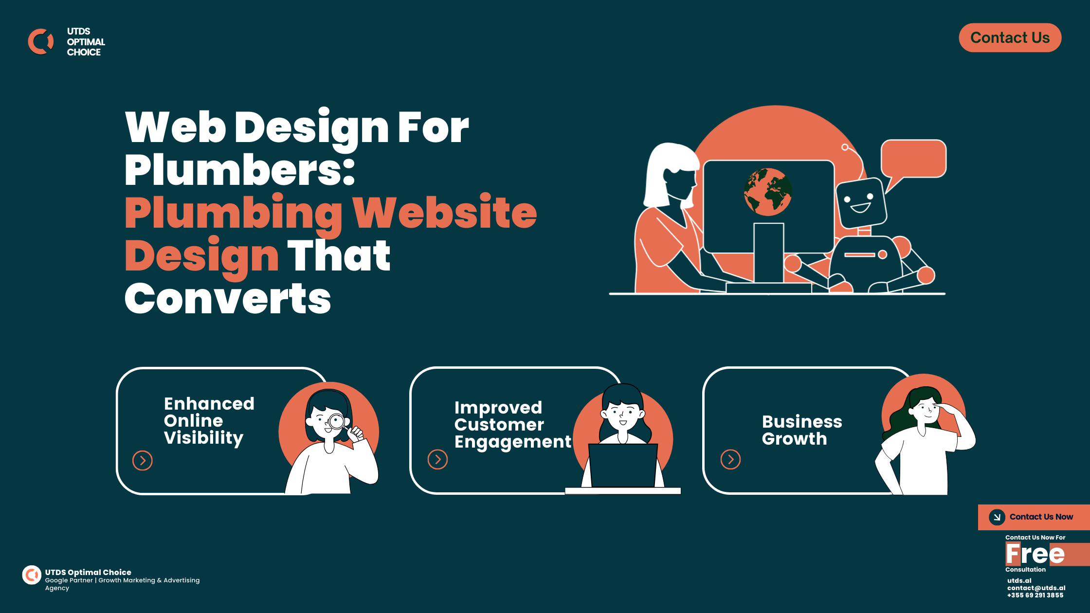
Are you a UK business owner looking to create or improve your online presence? You’ve come to the right place! In this guide, we’ll explore everything you need to know about website design, tailored specifically for the UK market.
Did you know that as of 2024, 68% of UK businesses have an Website? That’s right – in today’s digital age, having a website isn’t just an option, it’s a necessity. But not just any website will do. You need one that’s professionally designed, user-friendly, and optimised for search engines.
In this guide, we’ll cover everything from planning your website and choosing the right design approach, to implementing SEO strategies and leveraging PPC advertising. We’ll also share insights on how UTDS Optimal Choice, our premier web design agency, can help your business stand out in the crowded UK market.
So, whether you’re a small local business in Manchester or a growing B2B company in London, this guide will help you navigate the world of web design and digital marketing. Let’s dive in!
A great website design does more than look good, it captivates visitors, offers seamless navigation, and drives conversions. At UTDS Optimal Choice, we design websites that combine aesthetics with functionality, tailored to your brand’s unique needs. Our expert team crafts user-focused sites that keep visitors engaged and lead them to action. Let us help you build a website that not only looks impressive but also works hard for your business. Contact us now for free consultation!
Importance of Website Design
Why Your Website Matters In The UK Market
In the UK market, your website is often the first point of contact between your business and potential customers. It’s like having a 24/7 shop window that’s visible from John O’Groats to Land’s End! Here’s why having a top-notch website is crucial:
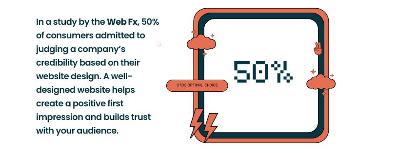
- First Impressions: In a study by the Web Fx, 50% of UK consumers admitted to judging a company’s credibility based on their website design. A well designed website helps create a positive first impression and builds trust with your audience.
- User Experience: With the average UK internet user spending over 6 hours online each day, providing a smooth and enjoyable user experience is key to keeping visitors on your site.
- Online Presence: In the UK’s competitive market, a strong online presence is essential. Your website is the cornerstone of this presence, complementing your social media and other digital marketing efforts.
- Local SEO: For UK businesses targeting local customers, a well-optimised website can significantly boost your local SEO efforts, helping you appear in “near me” searches.
How Good Web Design Boosts Your Business
Good website design isn’t just about aesthetics – it’s a powerful platform that can drive your business forward. Here’s how:
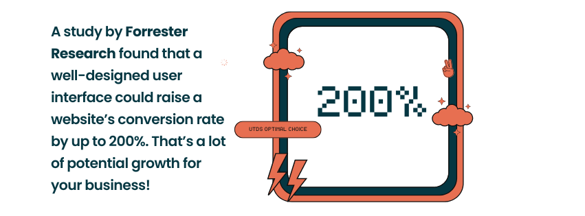
- Improved Conversion Rates: A study by Forrester Research found that a well-designed user interface could raise a website’s conversion rate by up to 200%. That’s a lot of potential growth for your business!
- Mobile Optimisation: With 87% of UK adults accessing the internet on smartphones, having a mobile first web design is no longer optional – it’s essential.
- Brand Consistency: Your website is a perfect platform to showcase your brand’s personality. Whether you’re a quirky startup in Brighton or an established financial firm in the City of London, your website should reflect your brand’s unique character.
- Load Time: UK consumers are impatient – 53% will leave a mobile site if it takes more than 3 seconds to load. Good design practices can significantly improve your sites load time, keeping visitors engaged.
- Visual Appeal: A visually appealing website can make your business stand out. Whether you’re aiming for a luxury website design or a dealership website design with more understated look, the right visual elements can make a big impact.
Planning Your Website
Steps to Plan a Successful Website
Planning is the foundation of any successful website project. Here’s a step-by-step guide to help you plan effectively:
- Define Your Goals: Are you looking to increase online sales? Build brand awareness? Provide customer support? Clear goals will guide your entire website strategy.
- Know Your Audience: Understanding your target audience is crucial. Are you targeting other businesses (B2B) or consumers (B2C)? What are their needs, preferences, and online behaviours?
- Content Strategy: Plan your website content. This includes deciding on your main pages, blog topics, and any downloadable resources you might offer.
- Design Preferences: Consider your design preferences. Do you want a minimalist look or something more elaborate? Look at other websites you like for inspiration.
- Functionality Requirements: List any specific features you need, such as an online booking system, e-commerce capabilities, or a customer portal.
- Budget and Timeline: Set a realistic budget and timeline for your website project.
Defining Your Website's Purpose and Goals
To create a website that truly serves your business, you need to have a clear understanding of its purpose and goals. Ask yourself:
- What’s the primary action you want visitors to take on your website? (e.g., make a purchase, fill out a contact form, download a brochure)
- How will your website support your overall business objectives?
- What key performance indicators (KPIs) will you use to measure your website’s success?
Understanding Your Target Audience
Knowing your audience is crucial for creating a website that resonates with them. Consider:
- Demographics: Age, location, income level, etc.
- Psychographics: Interests, values, lifestyle, etc.
- Online behaviour: How do they typically interact with websites? What devices do they use?
- Pain points: What problems are they looking to solve?
For example, if you’re a B2B web design agency targeting other UK businesses, your audience might be marketing managers or business owners looking for professional, results-driven web design services.
What Makes A Great Website Design?
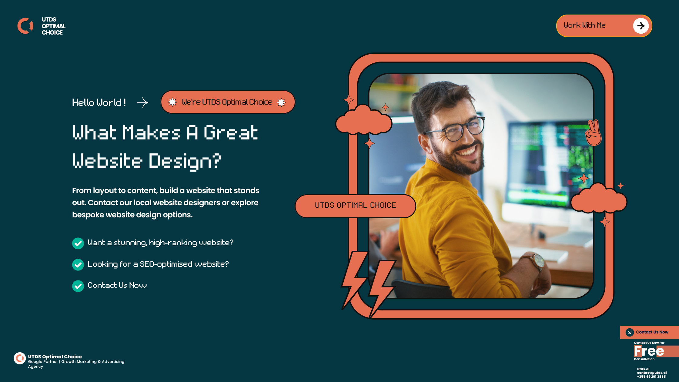
Website Design and Development
Different Web Page Design Approaches
When it comes to website design, there are several approaches to consider:
- Bespoke Web Design: This is a fully custom approach where every element is designed specifically for your business. It’s ideal for businesses with unique needs or those wanting a truly one-of-a-kind website.
- Template-Based Design: This approach uses pre-designed website templates as a starting point, which are then customised to fit your brand. It’s often more cost-effective and quicker to implement than bespoke design.
- Custom Web Design: This is a middle ground between bespoke and template-based design. It starts with a basic framework but involves significant customisation to meet your specific needs.
Each approach has its pros and cons, and the right choice depends on your business needs, budget, and timeline.
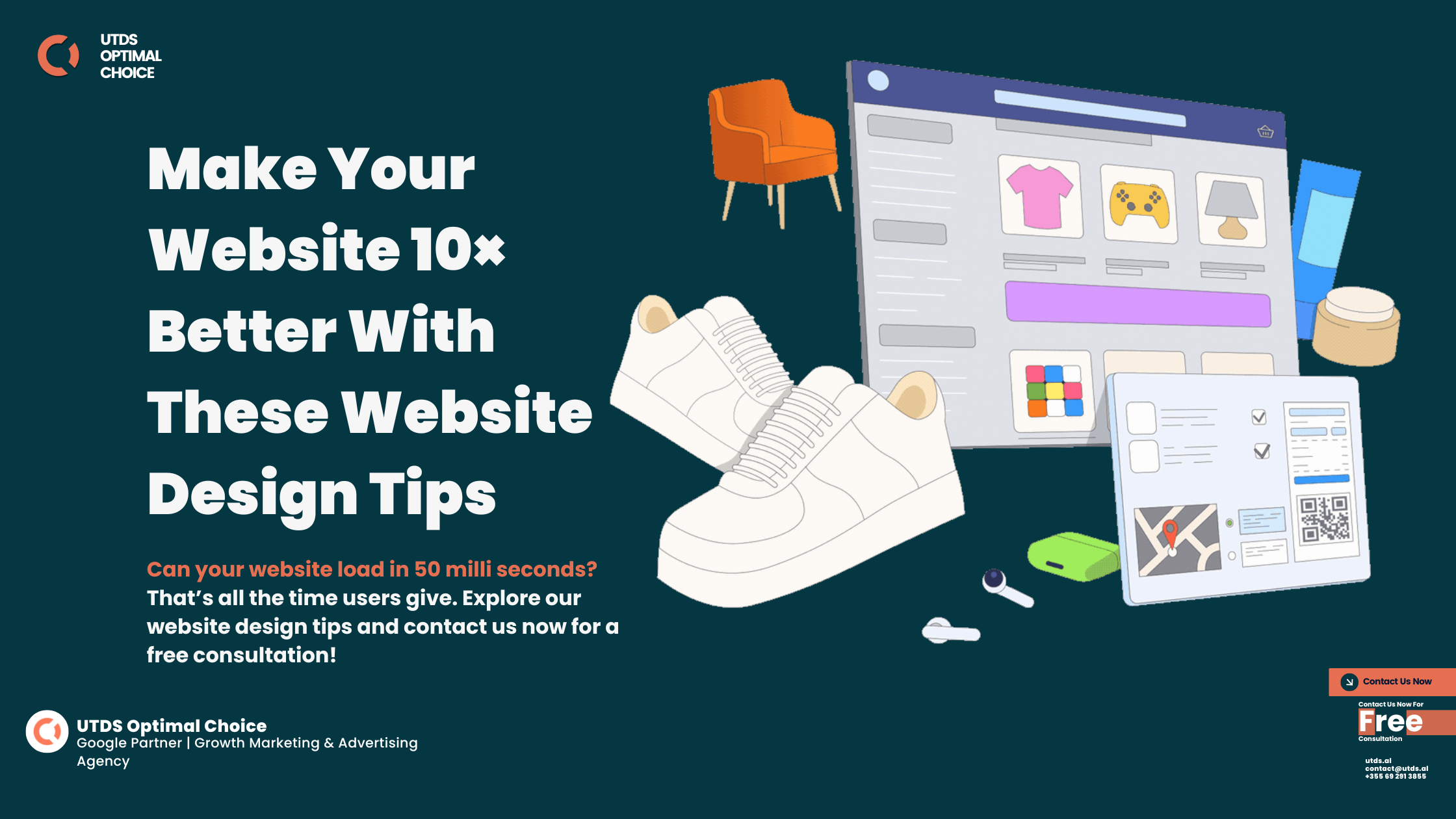
Key Elements of Effective Website Design
Regardless of the design approach you choose, certain elements are crucial for effective website design:
- Layout: A clean, intuitive layout helps visitors navigate your site easily. Consider using a grid system for organised, visually appealing layouts.
- Colour Scheme: Your colour scheme should align with your brand identity. For example, if you’re a luxury brand, you might opt for a sophisticated black and gold palette.
- Typography: Choose fonts that are easy to read and complement your brand style. Remember, different fonts can convey different moods – serif fonts often appear more traditional, while sans-serif fonts can feel more modern.
- Imagery: High-quality, relevant images can significantly enhance your website’s appeal. Consider using professional photography or high-quality stock images that represent your brand well.
- White Space: Don’t be afraid of white space (also known as negative space). It can help make your content more readable and your design more elegant.
- Call-to-Action (CTA): Clear, compelling CTAs guide your visitors towards the actions you want them to take, whether that’s making a purchase, signing up for a newsletter, or requesting a quote.
Platforms for Website Design
Choosing the right platform is crucial for your website’s success. Here are some popular options in the UK:
- WordPress: According to study by Kinsta wordpress is used by 42% of all websites globally, WordPress is highly versatile and perfect for everything from simple blogs to complex e-commerce sites.
- Wix: Known for its user-friendly interface, Wix is great for small businesses or entrepreneurs who want to create a professional-looking site quickly. Check the short guide by Website Builder Expert before choosing Wix.
- Shopify: If you’re planning an e-commerce site, Shopify is a top choice. It’s used by many UK online retailers due to its robust features and ease of use. Check the shopify guide here.
- Squarespace: Popular among creatives, Squarespace offers beautiful templates and is great for portfolio sites or small businesses.
Each platform has its strengths and weaknesses. For instance, WordPress offers unparalleled flexibility but may require more technical know-how, while Wix is easier to use but may be less customisable.
Cost of Website Design
Factors Influencing Website Design Costs in the UK
The cost of website design in the UK can vary widely, typically ranging from £500 – £1000 for a basic site and £10,000 or more for a complex, bespoke website. Key factors influencing cost include:
- Complexity: A simple 5-page informational site will cost less than a large e-commerce platform with hundreds of products.
- Design Type: Bespoke designs are generally more expensive than template-based designs.
- Features: Advanced features like booking systems, member areas, or complex forms will increase the cost.
- Content Creation: If you need help with copywriting or professional photography, this will add to the overall cost.
- SEO and Digital Marketing: Initial SEO setup and digital marketing strategy development will impact the price.
Budgeting Tips for UK Businesses
Here are some tips to help you budget effectively for your website project:
- Prioritise Features: List your must-have features and nice-to-have features. This can help you allocate your budget more effectively.
- Consider Long-Term Value: A well designed website is an investment. Consider the potential return on investment rather than just the upfront cost.
- Get Multiple Quotes: Reach out to several web design agencies or freelancers to get a range of quotes.
- Factor in Ongoing Costs: Remember to budget for ongoing costs like hosting, maintenance, and updates.
- Start Small and Scale: If the budget is tight, consider starting with a simpler site that you can expand over time as your business grows.
Implementing Your Website Design
Website Development Process
Here’s a typical process for implementing your website design:
- Discovery: This initial phase involves gathering requirements, understanding your business goals, and defining the project scope.
- Planning: Creating a sitemap, defining user journeys, and planning content.
- Design: Creating wireframes and visual designs for key pages.
- Development: Building the actual website based on the approved designs.
- Content Population: Adding all the text, images, and other content to the site.
- Testing: Rigorous testing across different devices and browsers to ensure everything works smoothly.
- Launch: Making the website live and accessible to the public.
- Post-Launch: Monitoring the site’s performance and making necessary adjustments.
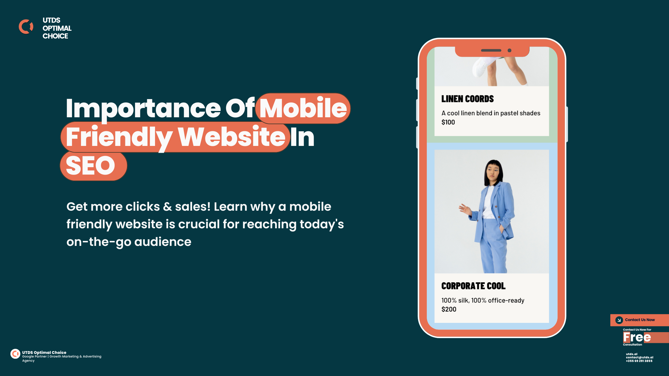
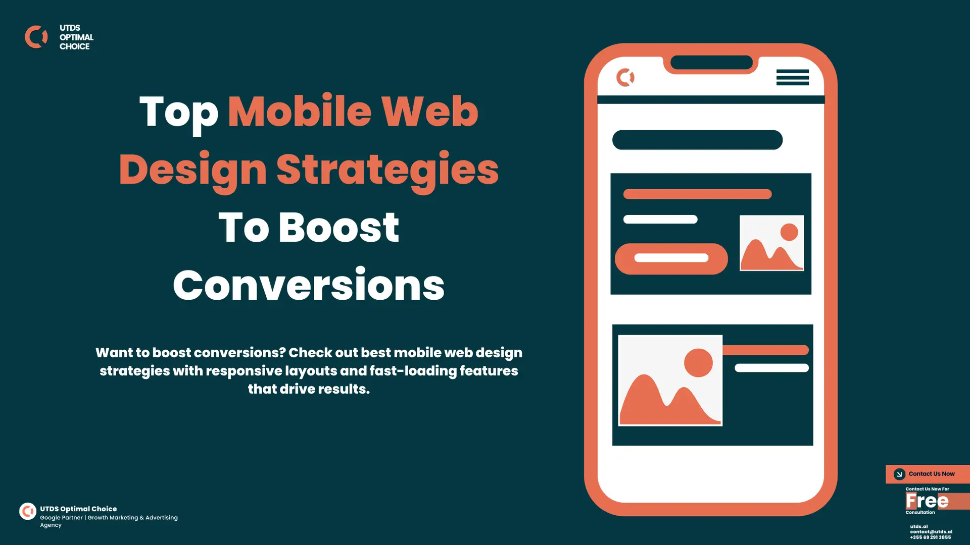
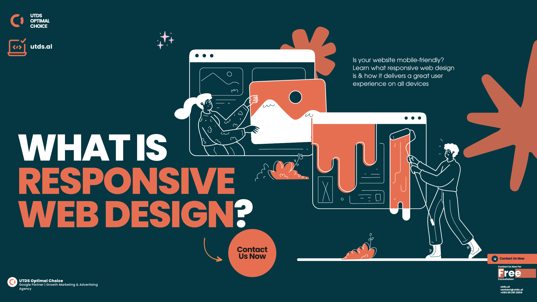
Importance of Responsive Design
With mobile internet usage overtaking desktop in the UK, responsive web design is more important than ever. A responsive website automatically adjusts its layout to look great on any device, whether it’s a smartphone, tablet, or desktop computer.
Google also uses mobile first indexing, meaning it predominantly uses the mobile version of a site for indexing and ranking. Therefore, having a mobile-friendly site is crucial for your SEO efforts.
Ensuring Accessibility and Compliance
Creating an accessible website isn’t just good practice – it’s the law in the UK. The Equality Act 2010 requires business website owners to make ‘reasonable adjustments‘ to make their sites accessible to people with disabilities.
Some key accessibility considerations include:
- Providing alt text for images
- Ensuring sufficient colour contrast
- Making your site navigable by keyboard
- Providing captions for video content
Additionally, ensure your website complies with GDPR (General Data Protection Regulation). This includes having a clear privacy policy, obtaining consent for cookies, and protecting user data.
Search Engine Optimisation (SEO)
Importance of SEO for UK Businesses
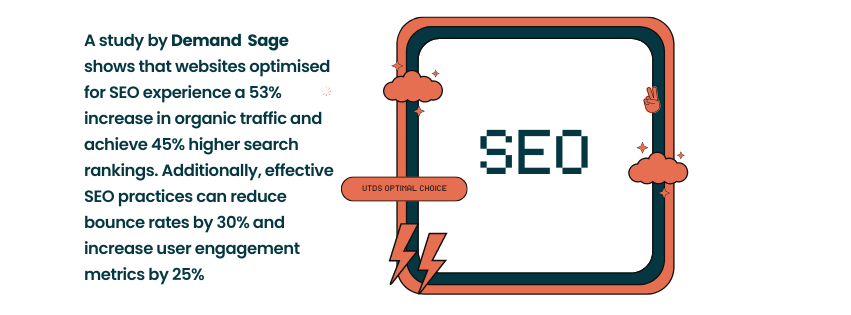
Search Engine Optimisation (SEO) is crucial for improving your website’s visibility in search engine results pages (SERPs). With 93% of online experiences beginning with a search engine, having a strong SEO strategy is essential for UK businesses.
On-Page SEO
On page SEO refers to optimising individual web pages to rank higher in search results. Key elements include:
- Keyword Research: Use tools like Google Keyword Planner or SEMrush to find relevant keywords for your business. For example, if you’re a web design agency in London, you might target keywords like “London web design agency” or “bespoke website design London“.
- Meta Tags: Optimise your title tags and meta descriptions. These appear in search results and can influence click-through rates.
- Content Optimisation: Create high-quality, relevant content that incorporates your target keywords naturally. This could include service pages, blog posts, and case studies.
- Internal Linking: Link between relevant pages on your site to help search engines understand your site structure and pass link equity.
Off-Page SEO
Off-page SEO involves actions taken outside of your website to improve its search engine rankings. This primarily involves building high-quality backlinks from reputable websites. Some strategies include:
- Content Marketing: Create valuable content that other sites want to link to.
- Guest Blogging: Write articles for other relevant websites in your industry.
- Local SEO: For businesses targeting local customers, ensure your business is listed in local directories and on Google My Business.
- Social Media: While social media signals aren’t a direct ranking factor, they can indirectly boost your SEO by increasing your online visibility and driving traffic to your site.
Technical SEO
Technical Aspects of SEO
Technical SEO focuses on improving the technical aspects of your website to help search engines crawl and index your site more effectively. Key areas include:
- Site Speed: Use tools like Google PageSpeed Insights to identify and fix issues slowing down your site. A faster site not only ranks better but also provides a better user experience.
- Mobile Optimisation: Ensure your site is fully responsive and provides a good experience on mobile devices.
- SSL Certificate: Having an SSL certificate (https://) is crucial for security and is a ranking factor for Google.
- XML Sitemap: Create and submit an XML sitemap to help search engines understand your site structure.
Clean URL Structure
Having a clean, logical URL structure helps both users and search engines understand your site. For example:
- Good: www.yoursite.co.uk/services/web-design
- Not so good: www.yoursite.co.uk/page.php?id=123
Schema Markup
Schema markup is a code that you put on your website to help search engines return more informative results for users. For example, you might use schema markup to show star ratings for product reviews directly in search results.
Pay-Per-Click (PPC) Advertising
PPC for UK Businesses
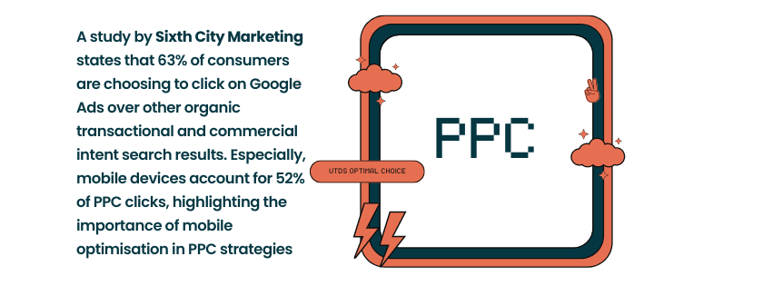
Pay Per Click (PPC) advertising is a model where you pay each time a user clicks on your ad. It’s a great way to drive targeted traffic to your website quickly. In the UK, Google Ads is the most popular PPC platform, followed by Bing Ads.
Setting Up a PPC Campaign
Here’s a basic process for setting up a PPC campaign:
- Keyword Research: Identify relevant keywords for your business. Tools like Google Keyword Planner can help.
- Create Ad Groups: Organise your keywords into themed ad groups.
- Write Compelling Ad Copy: Create ads that are relevant to your keywords and include a strong call-to-action.
- Set Your Budget: Decide how much you’re willing to spend daily or monthly.
- Choose Your Targeting: Select your target location, devices, and times for your ads to show.
- Create Landing Pages: Ensure you have relevant, optimised landing pages for your ads to link to.
Integrating PPC with SEO
PPC and SEO work best when used together. While SEO provides long-term, sustainable results, PPC can provide quick wins and valuable data. You can use PPC to test keywords for your SEO strategy, or to cover gaps in your organic search visibility.
Specialised Web Design Services
B2B Web Design Agencies
In the UK, b2b web design agencies like UTDS Optimal Choice play a crucial role in helping businesses create impactful online presences tailored for business-to-business interactions. These agencies understand the unique needs of B2B companies, focusing on lead generation, showcasing expertise, and building trust.
For instance, a b2b website design agency might create a site that highlights case studies, white papers, and industry certifications – elements that are particularly important for B2B decision-makers. The focus is often on creating a professional, credible image that resonates with other businesses.
Accounting Website Design
Accounting firms require websites that convey trust, professionalism, and expertise. Accounting website design often involves creating clean, organised layouts that make it easy for clients to find important information about services, tax deadlines, and financial advice.
For example, an accounting firm in London might have a website featuring a tax calculator tool, a resources section with downloadable tax guides, and a clear breakdown of their services for individuals and businesses.
Construction Website Design
Construction website design focuses on showcasing completed projects, highlighting expertise in different types of construction, and making it easy for potential clients to request quotes. These websites often feature high-quality images of completed projects, testimonials from satisfied clients, and detailed information about the company’s expertise and certifications.
A construction company in Manchester, for instance, might have a website with a gallery of completed projects, a section detailing their sustainable building practices, and an easy-to-use quote request form.
Finding the Right Local Website Designers
When looking for a website designer or website designer near me, it’s important to consider several factors:
- Portfolio: Look at their previous work to ensure their style aligns with your vision.
- Expertise: Ensure they have experience in your industry or with the type of website you need.
- Reviews: Check reviews from previous clients to gauge their reliability and quality of work.
- Communication: Choose a designer who communicates clearly and understands your needs.
- Location: While many designers work remotely, you might prefer website designers near me for face-to-face meetings.
Remember, the best website designer for your project is one who not only has technical skills but also understands your business goals and can translate them into an effective online presence.
Premium Web Design and Tailored Website Solutions
Premium web design goes beyond basic functionality to create a truly memorable user experience. It often involves:
- Custom Graphics and Animations: Unique visual elements that enhance your brand identity.
- Advanced Functionality: Tailored features that meet specific business needs.
- Superior User Experience: Intuitive navigation and engaging interactive elements.
- Performance Optimisation: Fast loading times and smooth performance across all devices.
Tailored website solutions are crucial for businesses with unique needs. Unlike off-the-shelf templates, these solutions are built from the ground up to align with your specific business processes and goals. Whether you’re a boutique hotel in the Cotswolds needing a bespoke booking system or a tech startup in London requiring a complex product demonstration platform, tailored solutions ensure your website works exactly as you need it to.
Integrating Social Media with Web Design
Integrating social media with web design is crucial. Here’s how you can effectively blend your social media presence with your website:
- Social Media Feeds: Embed live social media feeds on your website to showcase real-time updates and engage visitors.
- Share Buttons: Make it easy for visitors to share your content on their social networks.
- Social Login: Allow users to log in to your website using their social media accounts for a seamless experience.
- Consistent Branding: Ensure your website design aligns with your social media branding for a cohesive online presence.
Role of Analytics in Web Design
Analytics play a crucial role in modern web design, providing valuable insights that can drive continuous improvement. Here’s how analytics can benefit your website:
- User Behaviour Insights: Understand how visitors interact with your site, which pages they visit most, and where they drop off.
- Performance Monitoring: Track key metrics like page load times and identify areas for improvement.
- Conversion Tracking: Measure how effectively your website is achieving its goals, whether that’s sales, sign-ups, or enquiries.
- A/B Testing: Use data to compare different versions of your website and optimise for better performance.
Tools like Google Analytics are essential for gathering these insights and making data-driven decisions about your website’s design and content.
Website Security Best Practices
In an era of increasing cyber threats, website security is paramount. Here are some best practices to keep your website secure:
- Use HTTPS: Secure your website with an SSL certificate to encrypt data transmission.
- Regular Updates: Keep your content management system, plugins, and themes up to date.
- Strong Passwords: Use complex passwords and consider implementing two-factor authentication.
- Regular Backups: Backup your website regularly to ensure you can recover quickly from any issues.
- Security Plugins: Use reputable security plugins to add an extra layer of protection.
A secure website not only protects your business and customers but also boosts your credibility and can positively impact your search engine rankings.
Conversion Optimisation Techniques
Conversion optimisation is about making your website as effective as possible at achieving its goals. Here are some key techniques:
- Clear Call-to-Actions (CTAs): Use compelling, visible CTAs to guide users towards desired actions.
- Simplified Forms: Make forms as short and simple as possible to reduce abandonment.
- Social Proof: Use testimonials, reviews, and case studies to build trust.
- Personalisation: Tailor content based on user behaviour or preferences.
- A/B Testing: Continuously test different elements of your site to improve conversion rates.
Branding Through Web Design
Your website is a powerful branding tool. Here’s how to effectively communicate your brand through web design:
- Consistent Visual Identity: Use your brand colours, fonts, and logo consistently throughout the site.
- Brand Voice: Ensure all written content reflects your brand’s tone and personality.
- Brand Story: Use your website to tell your brand’s story and communicate your values.
- Unique Value Proposition: Clearly communicate what sets your brand apart from competitors.
Future Trends in Web Design
Staying ahead of web design trends can give your business a competitive edge. Here are some trends to watch:
- AI and Personalisation: Using artificial intelligence to create personalised user experiences.
- Voice User Interface: Optimising websites for voice search and navigation.
- Augmented Reality (AR): Incorporating AR elements for interactive product visualisation.
- Dark Mode: Offering dark mode options for improved user experience and energy efficiency.
- Micro-interactions: Small, engaging animations that enhance user experience.
Leading Web Design Agencies in the UK
The UK is home to many world-class web design agencies. Some of the leading agencies include:
- UTDS Optimal Choice: Affordable Web Design Services, bespoke web design services
- Superrb: Known for their creative, user-centric designs.
- Cyber-Duck: Experts in UX-focused, data-driven web design.
- Reactive Graphics: Specialises in bespoke, high-end web solutions.
While these agencies are highly regarded, at UTDS Optimal Choice, we pride ourselves on offering a more personalised service, tailoring our approach to each client’s unique needs and budget. Our team of expert designers and developers work closely with you to create a website that not only looks great but also drives real business results.
Renowned UK-Based Web Designers
The UK is home to many talented web designers who have made significant contributions to the field. Some notable names include:
- UTDS Optimal Choice: Known for providing exceptional web design services for small business, professional services, B2B, Construction, and Energy sector.
- Sarah Parmenter: Known for her user experience expertise and speaking at major design conferences.
- Anna Dahlström: A UX designer and the author of “Storytelling in Design“.
- Dan Mall: Although based in the US, he has had a significant influence on UK web design through his work and teaching.
At UTDS Optimal Choice, we’ve assembled a team of designers who bring this level of expertise to every project, ensuring your website is crafted to the highest standards.
Notable Businesses Using Bespoke or Luxury Websites
Many UK businesses have invested in bespoke or luxury websites to elevate their online presence. For example:
- Burberry: The luxury fashion brand’s website offers a high-end, immersive shopping experience.
- Rolls-Royce: Their website embodies luxury and sophistication, reflecting the brand’s premium status.
- Harrods: The famous department store’s website combines luxury with user-friendly ecommerce functionality.
While these are large, well-known brands, at UTDS Optimal Choice, we bring the same level of quality and attention to detail to businesses of all sizes. Whether you’re a small luxury boutique or a growing B2B firm, we can create a bespoke website that reflects your brand’s unique value.
How Our Website Design Agency Can Help
UTDS Optimal Choice is a leading website design agency, offering bespoke solutions for businesses of all sizes. Here’s how we stand out from other UK web design agencies:
- Tailored Approach: Unlike many agencies that offer one-size-fits-all solutions, we provide bespoke website design tailored to each client’s unique needs. Whether you’re a small local business in Birmingham or a large B2B company in Edinburgh, we craft a solution that fits your specific requirements.
- Industry Expertise: Our team has extensive experience across various industries, from car dealer website design to luxury website designs. This allows us to create designs that not only look great but also meet industry-specific needs and standards.
- Conversion-Focused Design: We don’t just create visually appealing websites; we design with conversion in mind. Our designs are crafted to guide your visitors towards desired actions, whether that’s making a purchase, filling out a contact form, or signing up for a newsletter.
- Mobile-First Approach: With mobile internet usage dominating in the UK, we take a mobile first approach to ensure your website looks and functions perfectly on all devices.
- SEO Integration: We build SEO best practices into every website we create, giving you a head start in search engine rankings.
- Ongoing Support: Our relationship doesn’t end at launch. We offer ongoing support and maintenance to ensure your website continues to perform optimally.
Our services include:
- Bespoke Website Design: Custom designs that perfectly reflect your brand and meet your business objectives.
- B2B Website Design: We understand the unique needs of B2B companies and create websites that generate leads and build credibility.
- Church Website Design: We help religious organisations create welcoming, informative online spaces for their communities.
- Responsive Web Design: All our websites are fully responsive, ensuring a seamless experience across all devices.
- Website Redesign: We can breathe new life into your existing website, improving its design, functionality, and performance.
Case Studies
Here are a few examples of how we’ve helped UK businesses achieve their online goals:
- Edutech: We helped a Edutech company in Albania improve their online presence with Branding and Logo Design, resulting in 0 to £50,000 Uplift In Revenue and increase in social media presence.
- Professional Services: For a plumbing and heating company based in London, we created a bespoke website design covering a wide range of counties around the UK with individual subdomains covering each region. Also helped with building a CRM and PPC to streamline the leads, and covert potential customers to sales. That increased their conversion rates by 50%.
- B2B Energy Company : Helped a renowned B2B Energy company in Essex, with Website Design, SEO, SMO, and Branding. We saw an increase in qualified leads after we redesigned their website with a focus on user experience and clear call-to-actions.
Similarly, we have a wide range of clientele spread across Europe from Scotland to Spain. Want to know more? Contact us now for free consultation and let us help you grow.
Closing Summary
Having a well-designed, high-performing website is crucial for UK businesses. From small local shops to large B2B enterprises, a strong online presence can significantly impact your business success.
Throughout this guide, we’ve covered the key aspects of website design and digital marketing, including:
- The importance of professional website design in the UK market
- How to plan your website effectively
- Different design approaches and key elements of effective design
- Cost considerations for UK businesses
- The website development process
- The crucial role of SEO and PPC in driving traffic and conversions
- How UTDS Optimal Choice can help you achieve your online goals
Remember, your website is often the first point of contact between your business and potential customers. It’s essential to make that first impression count.
Whether you’re looking to create a new website from scratch, redesign an existing site, or improve your online marketing efforts, UTDS Optimal Choice is here to help. Our team of expert designers, developers, and digital marketers are ready to help your business thrive online.
Want to Learn More?
If you’re interested in learning more about how we can help your business succeed online, we’d love to chat. Contact us for a free consultation where we can discuss your specific needs and how we can help you achieve your online goals.

