Every second, thousands of potential customers browse the internet on their phones. More than 60% of global web traffic comes from mobile devices, making mobile web design essential for businesses of all sizes. Either you run a local café or an online store, customers expect fast, seamless browsing experiences tailored to their mobile screens. Without a responsive and optimised mobile web page design, you risk losing them to competitors who prioritise mobile users.
Search engines like Google have made mobile optimisation a top priority through mobile first indexing. This means Google evaluates your mobile homepage design before your desktop version when determining rankings. A website that isn’t mobile friendly doesn’t just frustrate users, it also harms your visibility and credibility online.
An effective mobile website design is more than just resizing content for smaller screens. It’s about creating an intuitive experience with fast loading speeds, touch-friendly elements, and layouts optimised for smaller displays. By embracing great mobile web design, businesses can boost engagement, improve conversions, and stand out in today’s competitive market.
This guide will cover everything you need to know, from ‘why mobile optimisation is important‘ to the “latest trends in mobile web design‘. Whether you’re looking to redesign your website or build a fresh mobile website design from scratch, these insights will help you take the first step toward mobile success.
Is your mobile site ready to impress? We design mobile friendly websites that engage users and drive conversions across the UK, Spain, and Albania. Let’s Optimise Your Mobile Experience Today. Contact us now for free consultation.
Ready To Take Your Mobile Web Design To The Next Level?
Contact us today for a free consultation and start seeing real results!
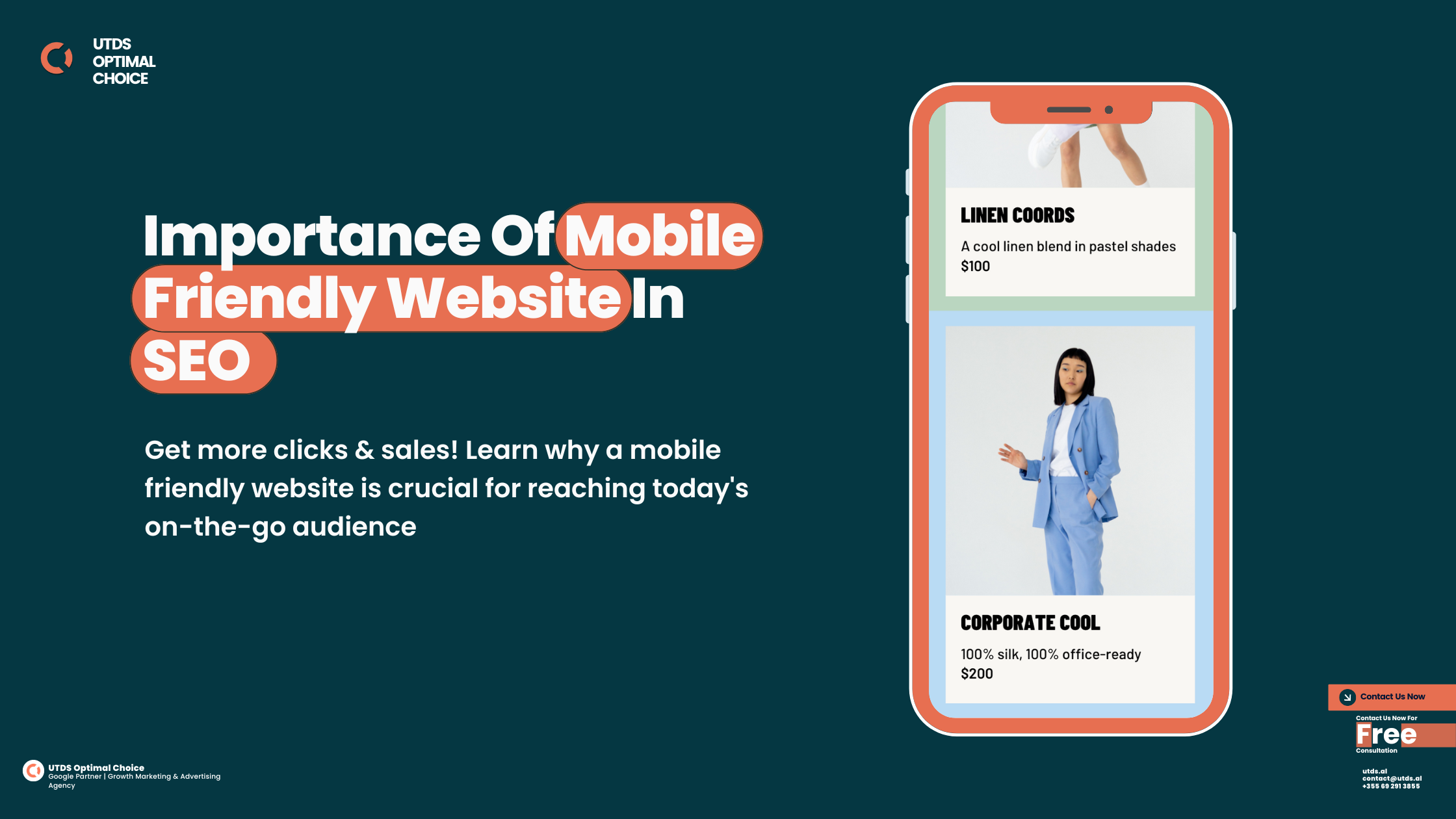
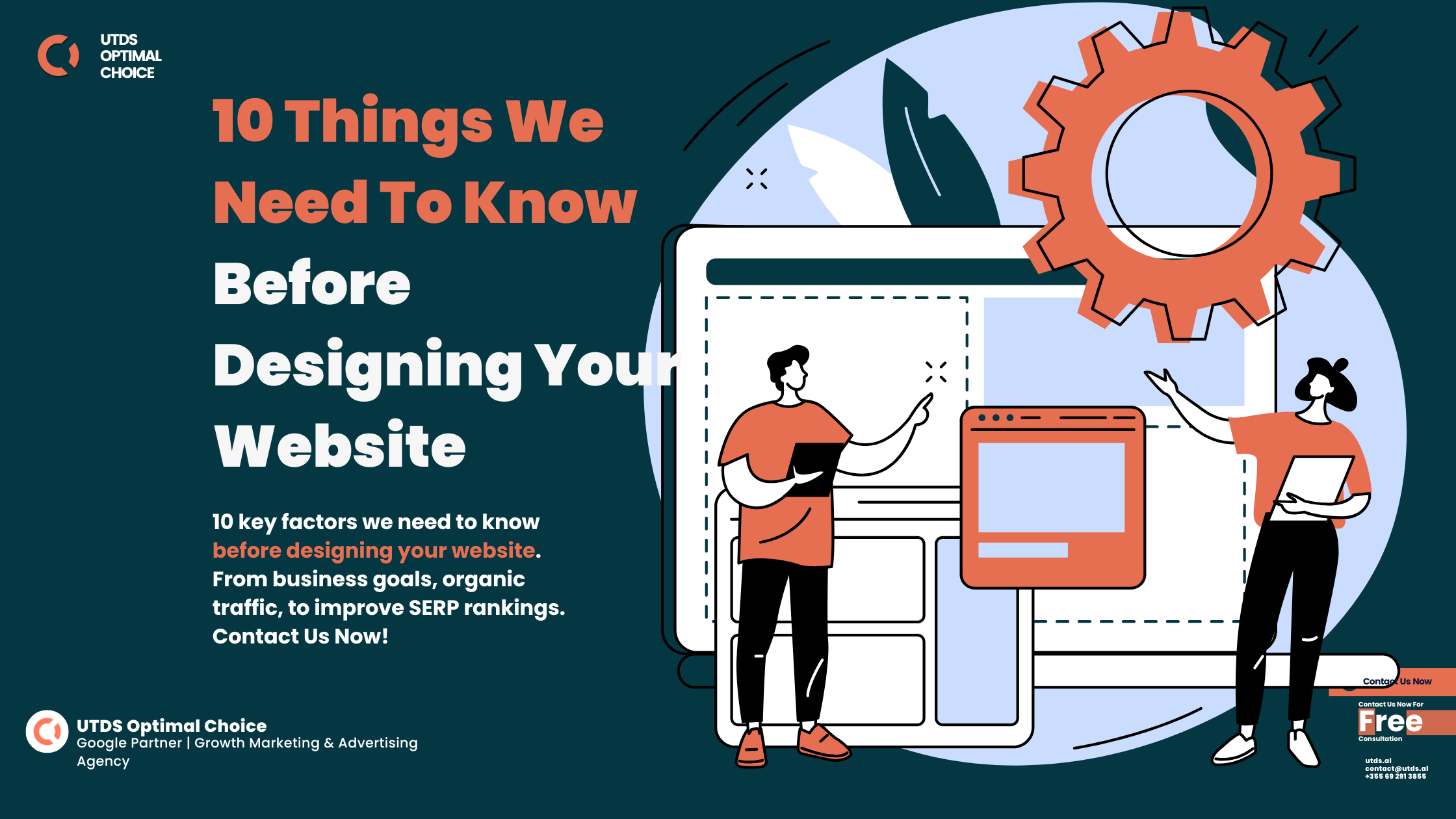
Top Mobile Web Design Strategies To Boost Conversions
What Is Mobile Web Design?
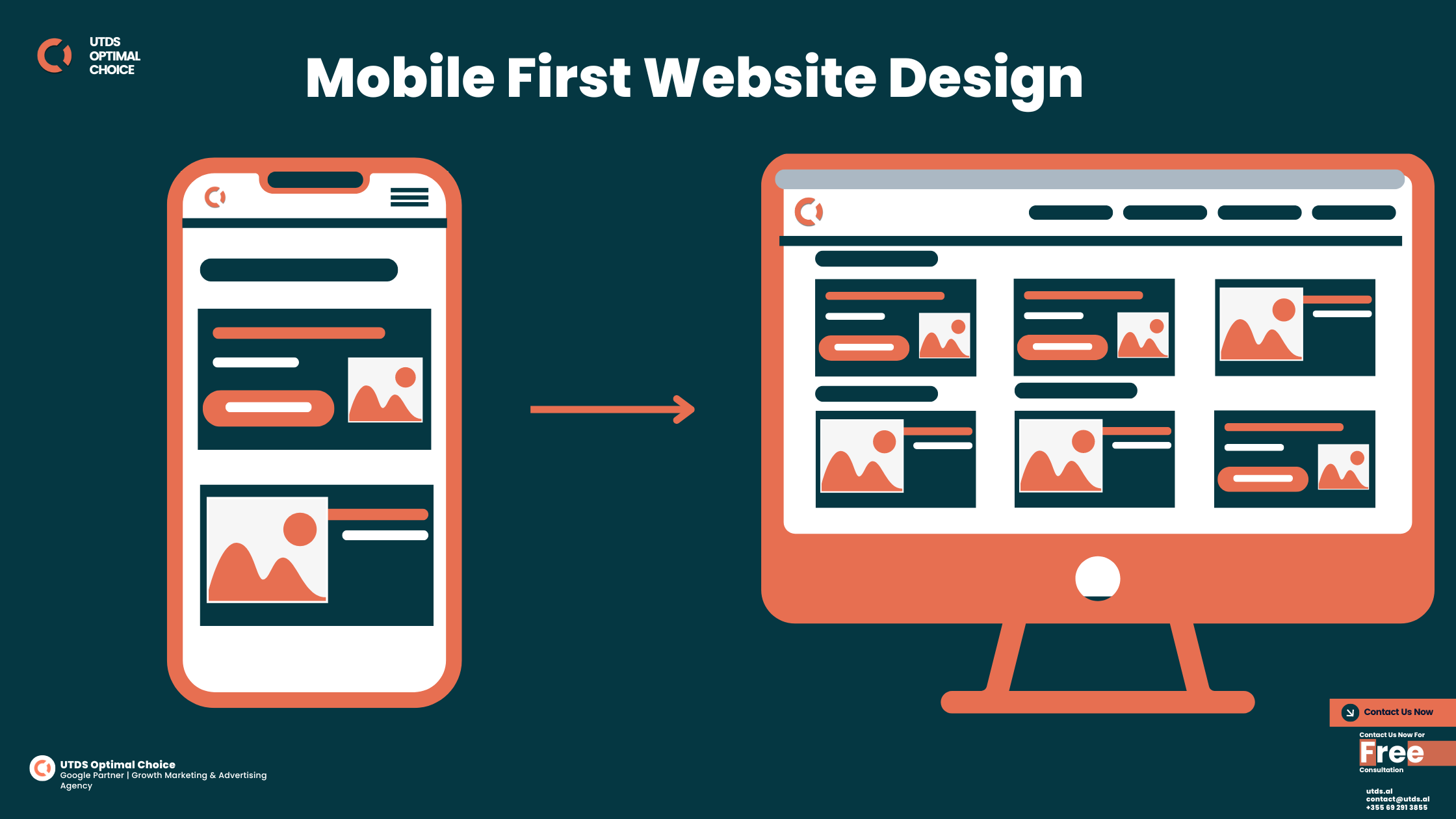
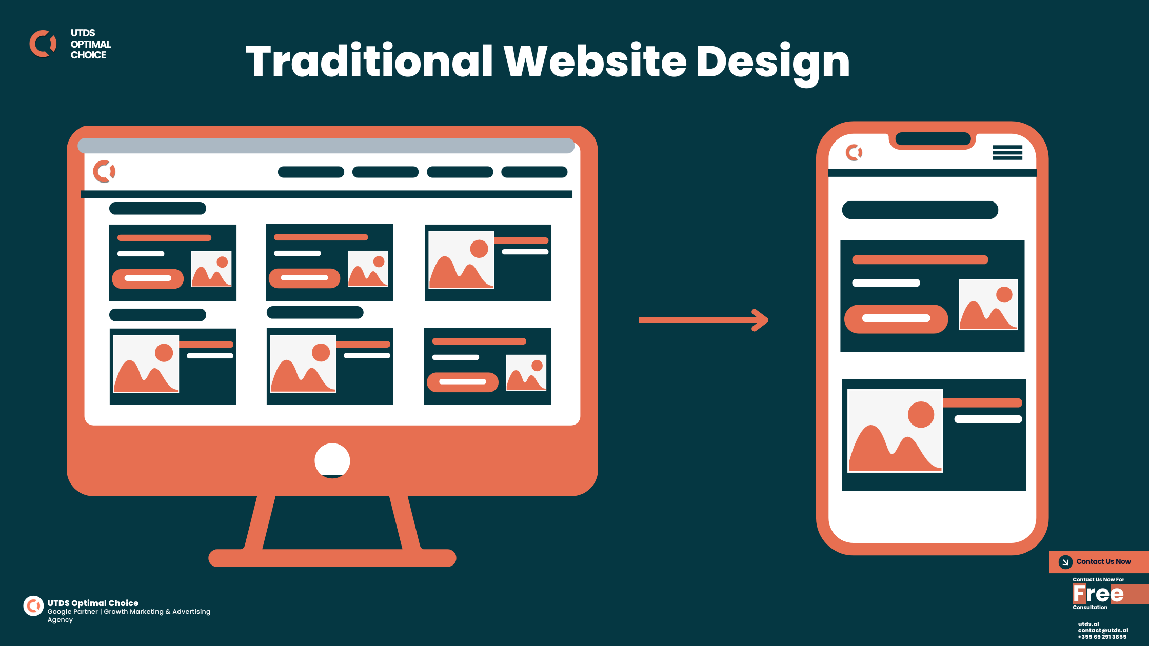
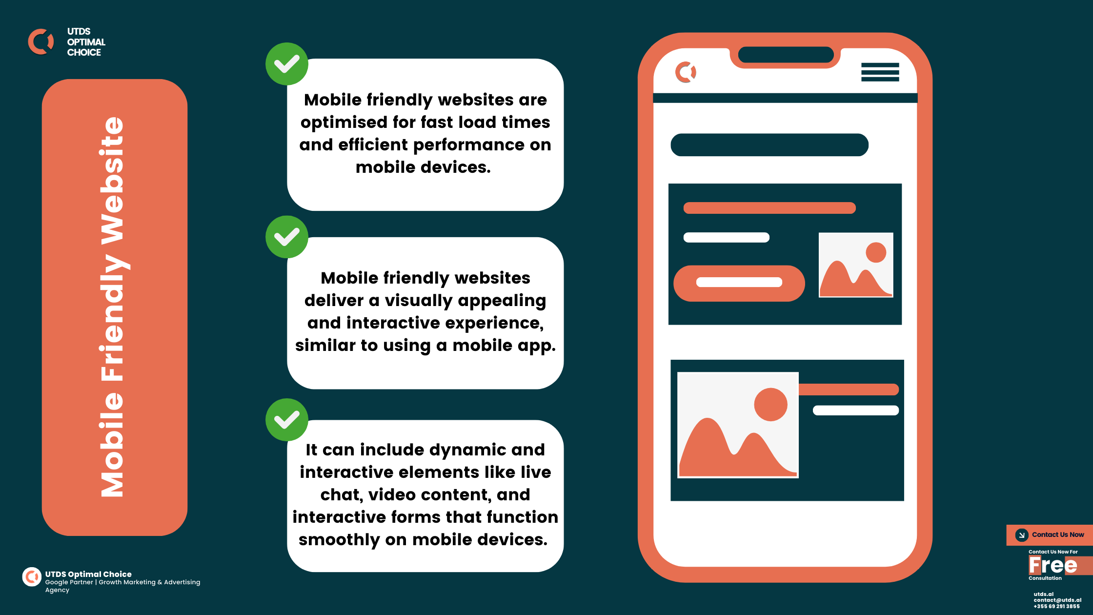
Mobile website design refers to creating a website that looks and works well on mobile devices like smartphones and tablets. This type of design is different from traditional website design, which focuses on how a site appears on desktop computers. With mobile website design, the goal is to ensure that users have a seamless and enjoyable experience when they visit your website on a smaller screen.
Key Components of Mobile Website Design:
- Responsive Design: A mobile responsive website design automatically adjusts its layout based on the device being used. Whether your visitors are using a phone, tablet, or desktop, your website will look great and be easy to navigate.
- Mobile Web Design: This is a critical aspect of responsive design, ensuring that all elements of your site are optimised for mobile browsing. Specifically tailored for smartphones, mobile phone web design ensures that your site is easy to use on smaller screens.
- Touch Friendly Navigation: Since mobile users navigate websites using their fingers, it’s important to have buttons, links, and menus that are easy to tap.
- Fast Loading Times: Mobile users expect websites to load quickly. If your site takes too long to load, visitors may leave and never come back. Check here to know how loading time impacts SEO and user experience.
- Mobile Friendly Web Design: Your website should be mobile friendly design, meaning it is designed to work well on all mobile devices, providing a smooth user experience. Each page of your website should be optimised to be a mobile friendly page, ensuring that users can easily read and interact with your content without zooming or excessive scrolling.
Why Mobile Website Is Important
Why Mobile Website Design is Non-Negotiable for Success in 2025
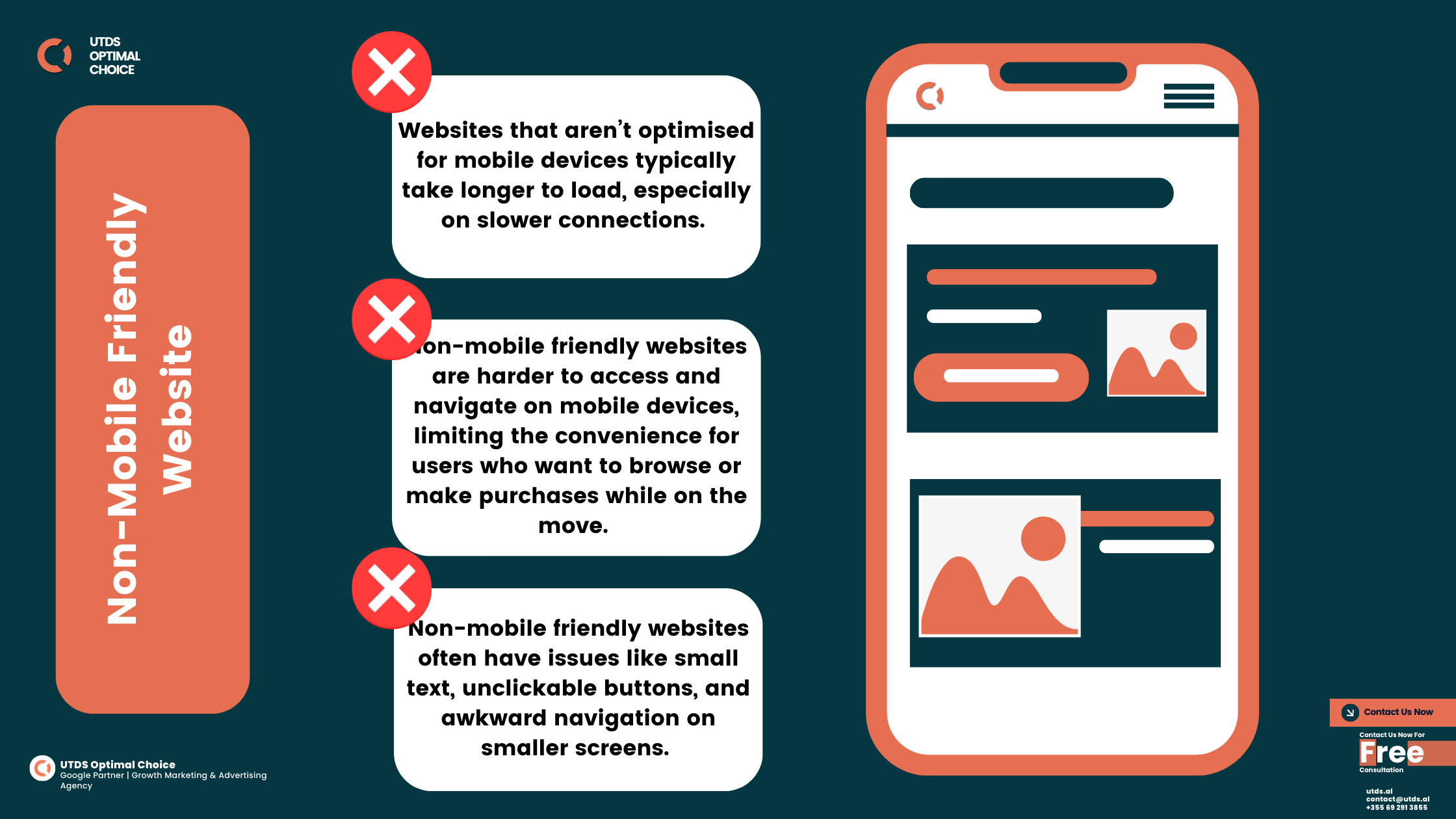
Picture this: A potential customer visits your website on their phone, hoping to make a quick purchase or learn about your services. Instead, they encounter slow loading times, confusing navigation, and text too small to read. Within seconds, they’re gone, along with the sale.
This scenario is all too common for businesses without a strong mobile website design. With over half of all web traffic coming from mobile devices, the importance of mobile optimisation cannot be overstated. Google’s mobile first indexing further amplifies this need by prioritising the mobile version of your website in search rankings. If your site isn’t optimised, you’re effectively invisible to a large portion of your audience.
A responsive mobile web page design does more than improve search visibility, it creates an engaging user experience that keeps visitors on your site longer.
Consider this:
53% of users abandon a website if it takes more than three seconds to load. On the other hand, businesses with fast, intuitive mobile homepage design report 67% higher engagement and sales compared to those relying on desktop-focused websites.
For small businesses, mobile optimised website levels the playing field. With a great mobile web design, even local shops can rank higher in local search results, attract on-the-go customers, and convert leads into loyal patrons. Meanwhile, e-commerce sites rely heavily on mobile website design to reduce cart abandonment rates and improve checkout experiences.
Mobile phone web design is no longer optional, it’s a lifeline for businesses looking to grow. By prioritising a user-friendly, fast, and responsive website, you can enhance customer trust, improve SEO rankings, and ultimately drive more conversions.
Signs Your Website Needs Mobile Website Redesign
6 Signs Your Website Needs a Mobile Redesign Today
Your website is the key digital brand of your business. But, Is it giving mobile users the experience they expect? If you don’t have a mobile optimised website, you’re not just losing traffic, you’re losing trust. Here are six telltale signs it’s time for a mobile website design update:
Skyrocketing Bounce Rates
A high bounce rate is a red flag that users aren’t engaging with your content. Slow loading speeds and confusing layouts, often due to outdated mobile web page design, are common culprits.
Slow Loading Speeds
Mobile users expect instant gratification. If your site takes longer than three seconds to load, you’re losing over 50% of potential visitors. A responsive and fast mobile homepage design ensures users stick around.
Frustrating Navigation
Struggling with tiny buttons or hidden menus? Poor usability is a surefire way to frustrate visitors. Investing in great mobile web design simplifies navigation, improving the overall user experience.
Unresponsive Layouts
A responsive mobile website design ensures your site looks flawless on every screen size. If images are cut off or text doesn’t fit, it’s time for a redesign.
Dated Aesthetics
Users expect modern, sleek visuals. If your website looks outdated or lacks features optimised for mobile users, such as tap-friendly buttons, you’re falling behind.
Low Search Engine Rankings
Poor mobile phone web design optimisation can directly harm your SEO. Google’s mobile first indexing prioritises responsive, fast-loading websites, making mobile web page design critical for visibility.
How to Address These Issues
Fixing these problems isn’t just about aesthetics, it’s about results. A professional mobile website design improves customer engagement, search rankings, and conversions. Whether it’s redesigning your mobile homepage design or reworking your mobile web page design, taking action now will future-proof your business for success.
Not sure where to start? Contact us for a free mobile optimisation audit and let us transform your site into a great mobile web design that delivers results.
Impact Of Non Mobile Friendly Websites
| Consequence | Explanation |
|---|---|
| Lower Search Rankings | Google ranks mobile friendly websites higher in search results, leading to more traffic. |
| Decreased Website Traffic | Non-mobile friendly websites often see a drop in traffic as users prefer mobile optimised sites. |
| Higher Bounce Rates | Visitors are more likely to leave a site that doesn’t work well on mobile, leading to higher bounce rates. |
| Lost Potential Customers | If users leave your site due to poor mobile experience, you lose potential customers and sales. |
Ready To Take Your Mobile Web Design To The Next Level?
Contact us today for a free consultation and start seeing real results!
Consequences Of Having Non Mobile Friendly Website
Not having a mobile friendly website can have several negative consequences for your business. Let’s take a closer look at some of these consequences:
Traffic Loss:
If your website isn’t optimised for mobile devices, you’re likely to lose a significant amount of traffic. As we mentioned earlier, more than 60% of all internet traffic comes from mobile devices. If your site isn’t mobile friendly, visitors are more likely to leave and go to a competitor’s site that offers a better mobile experience.
Keyword Ranking Drops:
Search engines like Google prioritise mobile friendly websites. If your site isn’t optimised for mobile, it’s likely to rank lower in search results. This means fewer people will find your website, leading to a decrease in traffic and potential customers.
Conversion Rate Disparities:
There’s a significant difference in conversion rates between mobile optimised websites and non optimised ones. According to research from Google, mobile friendly websites have a 67% higher chance of converting visitors into customers compared to non mobile friendly sites. This means that by not optimising your site for mobile, you’re potentially losing out on a lot of business.
Conversion Statistics: Desktop vs. Mobile Browsing
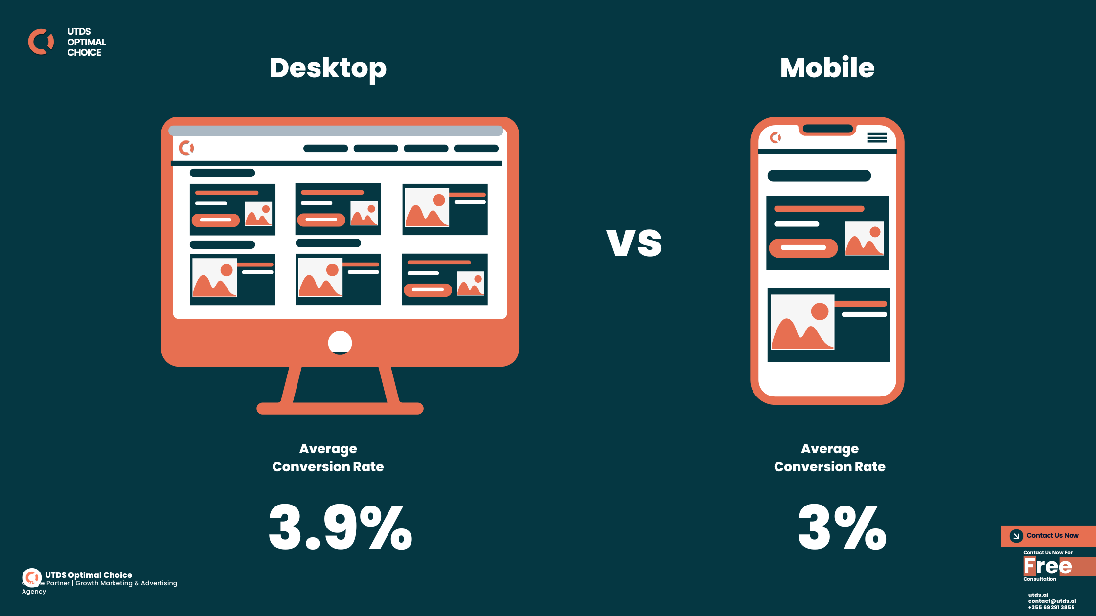
Understanding the differences between desktop and mobile browsing can help you see why mobile website design is so important. Here are some key statistics:
User Behaviour Differences
- Mobile Users: People who browse the internet on their phones are often looking for quick answers or simple tasks. They’re more likely to make impulse decisions, such as buying a product or signing up for a service.
- Desktop Users: Desktop users tend to spend more time researching and comparing options before making a decision. They’re more likely to engage in complex tasks that require multiple steps.
Conversion Rate Differences
- Mobile Conversion Rates: According to a report by Smart Insights, the average mobile conversion rate is about 3%. This might seem low, but when you consider the sheer volume of mobile traffic, it’s a significant number.
- Desktop Conversion Rates: Desktop conversion rates are generally higher, averaging around 3.9%. However, with the increasing shift towards mobile browsing, it’s crucial to ensure that your mobile website is optimised to capture these conversions.
Conversion Rate Comparison
| Device | Average Conversion Rate | Explanation |
|---|---|---|
| Mobile | 3% | Mobile users are more likely to make quick decisions, so a mobile friendly site can drive conversions. |
| Desktop | 3.9% | Desktop users take more time to research, leading to higher conversion rates on well-optimised sites. |
Mobile Traffic Is Dominant
As mobile traffic continues to grow, businesses must prioritise mobile website design to stay competitive. Websites that are easy to navigate, fast to load, and visually appealing on mobile devices are more likely to convert visitors into customers.


Mobile Website Design For Small Business
How Small Businesses Can Thrive with Mobile Website Design
For small businesses, standing out in a competitive market can be tough. With limited resources, investing in areas that yield the highest returns is critical, and that’s where mobile website design comes in. In a world dominated by smartphones, a mobile friendly website isn’t just an option, it’s a necessity.
Boosting Local SEO with Mobile Optimisation
When someone searches for “cafés near me” or “local plumber,” a mobile optimised website makes all the difference. Research shows that 76% of people who search for nearby services on their phones visit a business within 24 hours. A responsive mobile web page design ensures your small business ranks higher in local searches and captures these high-intent customers.
Competing with Bigger Brands
A professional mobile homepage design helps small businesses level the playing field with larger competitors. Customers prioritise convenience and ease of use, so offering a seamless, fast, and intuitive mobile experience builds trust and keeps users engaged.
Maximising ROI with Affordable Solutions
Unlike expensive advertising campaigns, investing in a great mobile web design delivers measurable results. Small businesses with optimised websites see higher engagement, more inquiries, and increased sales, all for a fraction of the cost of traditional marketing efforts.
Catering to On-the-Go Customers
Today’s customers want instant access to information. Whether they’re searching for a boutique web design agency or a local repair service, they expect fast loading speeds and touch-friendly navigation. An SEO optimised mobile website design ensures you meet these demands, making your business a go-to option for mobile users.
Why Mobile Optimised Website is Non-Negotiable
For small businesses, a responsive mobile web page design doesn’t just improve your website’s aesthetics, it impacts your bottom line. By investing in fast, intuitive, and user-friendly mobile solutions, you can:
- Attract more local traffic.
- Build trust with customers.
- Compete effectively with larger brands.
Ready to take your small business to the next level? Contact us for a free consultation and let us craft a great mobile web design that drives results.
Ready To Take Your Mobile Web Design To The Next Level?
Contact us today for a free consultation and start seeing real results!
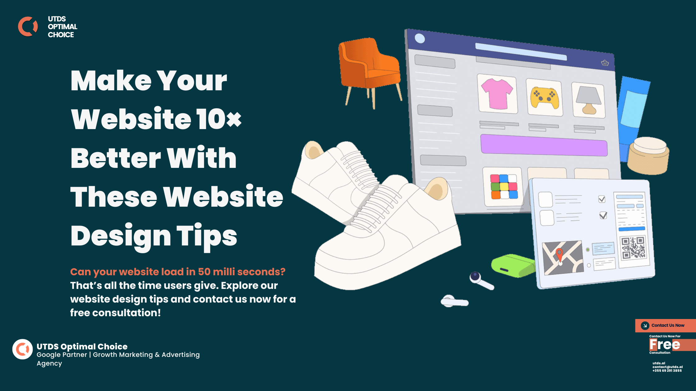
Mobile Web Design Best Practices
A successful mobile website design is built with mobile users in mind, offering a seamless, fast, and engaging experience. Here are six essential features that define a truly effective mobile web page design:
Responsive Design for Seamless Browsing
A responsive mobile homepage design adapts effortlessly to any device, ensuring a flawless experience whether your customers are browsing on a smartphone, tablet, or laptop. This adaptability not only enhances user satisfaction but also improves your SEO rankings, as Google favors responsive websites in its mobile first indexing.
Lightning-Fast Loading Speeds
Did you know that 53% of users leave a site if it takes longer than three seconds to load? A fast mobile website design ensures visitors stay engaged, reducing bounce rates and increasing the likelihood of conversions. Compressing images, using efficient code, and leveraging content delivery networks (CDNs) are essential for speed optimisation.
Intuitive and Simplified Navigation
Mobile users expect simplicity. Effective mobile web page design includes clear menus, easy-to-tap buttons, and minimal scrolling to help users find information quickly. When navigation is intuitive, users are more likely to explore your site and take action.
Touch-Friendly Interactions
On mobile devices, users rely on touch gestures. A great mobile web design incorporates large buttons, swipe-friendly menus, and optimised forms that make interactions effortless.
High-Quality, Optimised Visuals
Images and videos must load quickly while maintaining clarity on smaller screens. Additionally, content should be concise yet engaging, ensuring visitors get the information they need instantly. This is a hallmark of effective mobile homepage design.
Compelling Call-to-Actions (CTAs)
CTAs guide mobile users toward their next step, whether it’s making a purchase, contacting your business, or signing up for a service. Well-placed CTAs integrated into your mobile web page design can significantly boost conversions.
Why These Features Drive Results
Each of these features contributes to creating a great mobile web design that improves user experience, reduces bounce rates, and drives more sales. By focusing on responsive mobile web design best practices, fast loading speeds, and intuitive navigation, businesses can meet customer expectations and outperform competitors.
Does your mobile website have these must-have features? Don’t miss out on mobile users, reach out today and let us deliver a mobile website design that sets your business apart.


How To Optimise A Website For Mobile
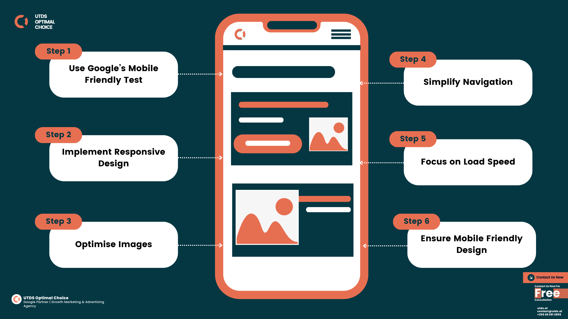
Mobile optimisation isn’t just about resizing your desktop website, it’s about creating a tailored experience for users on-the-go. A professional mobile website design ensures fast loading speeds, intuitive navigation, and engaging content, all of which drive conversions and improve SEO rankings. Follow these steps to optimise your site for mobile:
Use a Responsive Design Framework
Responsive mobile web page design adapts your site’s layout, fonts, and visuals to fit any screen size. Whether users access your site on a tablet or a smartphone, a responsive framework ensures seamless functionality and boosts your site’s performance in Google’s mobile first indexing.
Improve Loading Speeds
Mobile users won’t wait for slow websites. Ensure your pages load quickly by:
- Compressing images and videos for faster downloads.
- Minimise HTTP requests and enable browser caching.
- Using a Content Delivery Network (CDN) to deliver content faster.
Faster speeds not only enhance user experience but also reflect a great mobile web design that keeps visitors engaged.
Simplify Navigation
Mobile users value convenience. Make your site easy to explore by:
- Implementing clear, collapsible menus.
- Using large, tappable buttons for key actions.
- Adding breadcrumb navigation for better usability.
An intuitive mobile homepage design ensures visitors find what they need quickly, reducing bounce rates and increasing engagement.
Optimise for Touch Interactions
On mobile, every tap matters. A touch-friendly mobile web page design includes:
- Large, responsive buttons for effortless interaction.
- Swipe-friendly galleries and menus.
- Minimising the need for pinching and zooming to improve accessibility.
Test Across Devices and Browsers
What works on one device might not work on another. Test your mobile website design using tools like Google’s Mobile Friendly Test or BrowserStack to ensure a flawless experience across various devices and browsers.
Align Content for Mobile Readability
Engaging content is concise, scannable, and tailored for smaller screens. Ensure your text is:
- Organised with bullet points and short paragraphs.
- Sized appropriately with clear fonts for mobile viewing.
- Structured with headings and subheadings for easy navigation.
Readable content is a hallmark of great mobile web design, keeping users informed and engaged.
Enhance SEO for Mobile
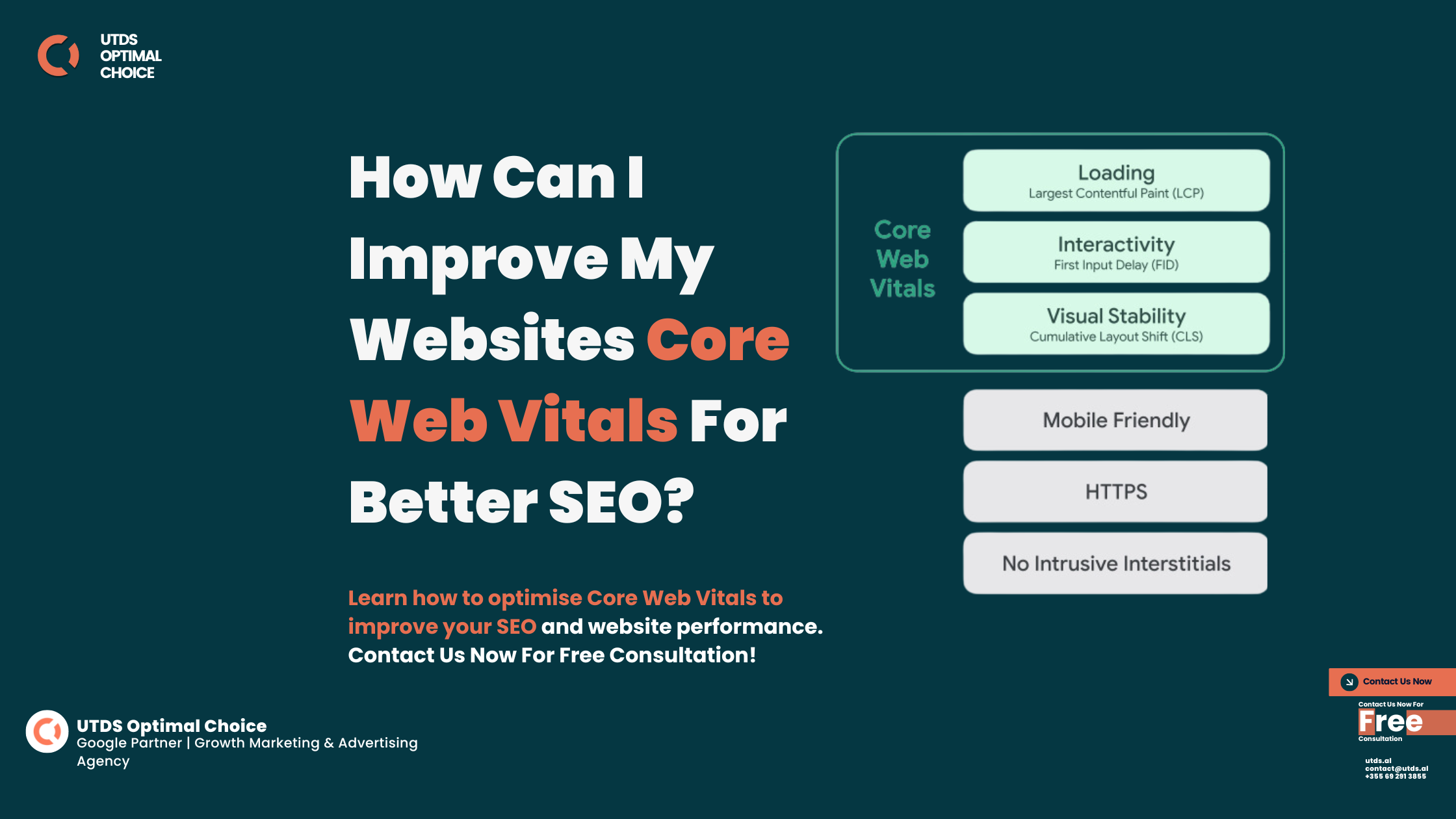
A mobile friendly website performs better in search results. Focus on:
- mobile first indexing with responsive design.
- Using location-based keywords for local SEO.
- Adding structured data to improve visibility in search engines.
Optimised SEO best practices strengthen the impact of your mobile homepage design, attracting more traffic and leads.
Why do you need to follow mobile web design best practices
Businesses that prioritise mobile website design don’t just keep up with trends, they stay ahead of the competition. An optimised mobile web page design reduces bounce rates, improves SEO rankings, and delivers seamless user experiences that drive conversions.
Is your website ready for mobile users? Contact us today for expert mobile website design services and transform your site into a high-performing, user-friendly experience.
Ready To Take Your Mobile Web Design To The Next Level?
Contact us today for a free consultation and start seeing real results!
Common Mistakes In Mobile Website Design
7 Common issues of using mobile web design template
Creating a successful mobile website design requires more than just adapting your desktop site for smaller screens. Even minor mistakes can frustrate users, harm your SEO rankings, and drive potential customers away. Here are the most common pitfalls to avoid and how to fix them:
Slow Loading Speeds
Speed is everything for mobile users. Research shows that 53% of visitors abandon a site that takes longer than three seconds to load. Oversized images, heavy scripts, and poor server performance are often to blame.
Tip: Compress media files, reduce redirects, and use a Content Delivery Network (CDN) to ensure fast loading speeds.
Poor Navigation Design
Cluttered menus, tiny buttons, and confusing layouts can make it difficult for mobile users to find what they need. A user-friendly mobile homepage design simplifies navigation and guides visitors to key actions.
Tip: Limit menu options, use a hamburger menu for small screens, and ensure all buttons are tappable.
Unresponsive Layouts
Non-responsive websites fail to adjust to different screen sizes, forcing users to pinch and zoom or scroll excessively. This leads to a frustrating experience and higher bounce rates.
Tip: Implement a responsive mobile website design framework that adjusts seamlessly to all screen sizes.
Overloading Content
Mobile screens are smaller, and visitors don’t have the patience for excessive text or visuals. A cluttered mobile web page design overwhelms users and detracts from your message.
Tip: Prioritise essential content, break it into digestible chunks, and use headings, bullet points, and short paragraphs.
Neglecting Touch-Friendly Features
Small buttons, crowded links, and non-intuitive gestures can frustrate mobile users. A well optimised mobile homepage design includes touch-friendly elements that enhance usability.
Tip: Use large, spaced-out buttons and incorporate swipe-friendly galleries and menus.
Ignoring Mobile SEO
A great mobile web design is useless if users can’t find your site. Failing to optimise for mobile first indexing affects your search rankings and visibility.
Tip: Use mobile focused keywords, optimise meta tags, and ensure your site passes Google’s Mobile Friendly Test to strengthen your mobile website design.
Skipping Regular Testing
Bugs, broken links, and poor performance often go unnoticed without regular testing. These issues can damage your brand’s credibility and user trust.
Tip: Use tools like Google’s Mobile Friendly Test and BrowserStack to evaluate your mobile web page design across devices and browsers.
Why Fixing These Mistakes is Essential
Each of these errors can significantly impact your website’s performance, user experience, and SEO rankings. By addressing these common pitfalls, you can create a great mobile web design that attracts users, keeps them engaged, and converts them into loyal customers.
Are you using mobile web design templates? Don’t let poor mobile web design template hold your business back. Contact us today to create a fast, responsive, and user-friendly mobile website design that guarantees results.
Mobile Web Design Trends To Watch In 2025
Top Mobile Web Design Trends You Need to Know in 2025
Keeping up with the latest mobile website design trends isn’t just about looking modern, it’s about delivering the experiences your users expect. In 2025, these cutting-edge trends will define what makes a successful mobile web page design:
Dark Mode Integration
Dark mode has evolved from a novelty to a user preference, offering reduced eye strain and extended battery life for mobile devices. Integrating dark mode into your mobile homepage design gives users the choice to switch between light and dark themes, enhancing accessibility and customisation.
Voice Search Optimisation
With voice search becoming mainstream, optimising your mobile website design for natural language queries ensures better visibility. Voice assistants like Siri and Alexa rely on concise, keyword rich content to fetch results.
Tip: Use long-tail keywords and structure your content around conversational queries to capture voice search traffic.
Micro-Animations and Interactive Features
Micro animations, such as button hover effects or subtle loading indicators, make your site feel more dynamic and engaging. These elements in mobile homepage design keep users entertained while guiding them through your site.
Progressive Web Apps (PWAs)
PWAs deliver an app-like experience without the need for downloads. They’re fast, responsive, and accessible offline, making them a game-changer for businesses with high traffic or e-commerce needs.
Augmented Reality (AR) Integration
Augmented reality bridges the gap between the digital and physical worlds. Integrating AR into your mobile website design allows users to interact with products virtually, enhancing engagement and driving purchase decisions.
Minimalist Design with Bold Typography
Simplicity is key in 2025. Minimalist mobile homepage design features clean layouts, bold typography, and ample white space, creating a visually appealing and easy-to-navigate experience.
Tip: Focus on delivering high-resolution visuals and interactive content without compromising performance.
Why These Mobile Web Design Trends Are Important
Adopting these trends in your mobile website design keeps your business relevant, improves user experience, and positions you as a leader in your industry. From dark mode to AR, these innovations enhance functionality and engagement, driving better results for your website.
Is your website ready for 2025? Let us help you integrate the latest trends into a great mobile web design that sets your business apart. Contact us today to get started!
Ready To Take Your Mobile Web Design To The Next Level?
Contact us today for a free consultation and start seeing real results!
Accessibility And Inclusive Mobile Web Design
Why Accessibility And Inclusive Design Are Important for Mobile Website Designs
Accessibility and inclusive design go beyond meeting compliance standards, they make your website usable for everyone. A well-thought-out mobile website design ensures that people of all abilities can access, navigate, and engage with your content. By prioritising accessibility, businesses can build trust, expand their audience, and create a positive user experience for all.
Importance of Accessibility in Mobile Web Design
Over 15% of the global population lives with some form of disability. Without accessible mobile web page design, businesses risk alienating a significant portion of their audience. Beyond ethics, accessibility aligns with legal standards like the Web Content Accessibility Guidelines (WCAG) and improves SEO by creating a user-friendly experience.
Features of an Accessible Mobile Website Design
An inclusive mobile homepage design incorporates:
- Alt Text for Images: Helps screen readers describe visual elements to visually impaired users.
- Keyboard-Friendly Navigation: Ensures users relying on keyboards or adaptive technologies can easily browse your site.
- Sufficient Color Contrast: Improves readability for users with visual impairments.
- Scalable Fonts: Allows users to adjust text size for easier reading on small screens.
Mobile Web Design Best Practices
A great mobile web design ensures:
- Simple layouts to reduce cognitive load for users with disabilities.
- Audio descriptions for video content, making it accessible to users with hearing impairments.
- Logical content structure with clear headings, enhancing screen reader usability.
Tools for Testing Accessibility
Testing your mobile website design is crucial for identifying and resolving accessibility issues. Use tools like:
- WAVE Accessibility Checker: Detects accessibility problems and offers solutions.
- Google Lighthouse: Evaluates your site’s accessibility and provides actionable recommendations.
- Color Contrast Analysers: Ensure text is readable against background colors.
The Business Benefits of Accessibility
Accessibility doesn’t just cater to users with disabilities, it enhances the experience for all users. Businesses that prioritise accessible mobile web page design enjoy:
- Increased traffic and customer engagement.
- Higher SEO rankings, as search engines favor accessible websites.
- Improved brand reputation for inclusivity and ethical practices.
Why Accessibility is important?
Accessibility isn’t just about compliance, it’s about creating a welcoming and inclusive space for all users. By investing in accessible mobile homepage design, businesses can reach new audiences, build trust, and stay ahead of competitors in an increasingly mobile first world.
Ready to make your website accessible to all? Contact us today for an inclusive mobile website design that enhances user experience and complies with global standards.
Benefits Of Investing In Mobile Web Design
Investing in mobile website design isn’t just a choice, it’s a necessity for businesses aiming to thrive. A responsive and user-friendly mobile website design does more than improve aesthetics; it drives meaningful results, from higher customer satisfaction to increased revenue. Here’s why investing in mobile web page design pays off:
Superior User Experience
A seamless mobile homepage design ensures visitors can navigate your site effortlessly, whether on a smartphone or tablet. Features like fast loading speeds, touch-friendly buttons, and intuitive layouts create a user experience that keeps visitors engaged and encourages them to return.
Boosted Search Engine Rankings
Google’s mobile first indexing prioritises websites optimised for mobile users. A professional mobile website design not only enhances user experience but also improves search engine rankings, making it easier for your target audience to find your business.
Tip: Pair responsive mobile web design with local SEO strategies to attract on-the-go users searching for nearby services.
Higher Engagement and Conversion Rates
A well-designed mobile site encourages users to take action, whether it’s making a purchase, submitting a form, or exploring more pages. Optimised mobile homepage design with clear calls-to-action (CTAs) can significantly boost conversions.
Reaching a Broader Audience
With mobile devices accounting for over 60% of global web traffic, an effective mobile website design ensures your business reaches a diverse audience. Whether customers are browsing locally or internationally, your website will perform seamlessly, regardless of the device.
Future-Proofing Your Website
Investing in a great mobile web design isn’t just about meeting today’s expectations, it’s about preparing for tomorrow’s innovations. Features like voice search optimisation, and Progressive Web Apps (PWAs) ensure your site stays ahead of the curve.
Why Mobile Optimisation is the Best Investment
The benefits of optimised mobile website extend far beyond appearance. From enhanced user experiences to improved search rankings, a responsive mobile website design delivers measurable returns. Businesses that prioritise mobile users gain a competitive edge in today’s fast-paced digital landscape.
Don’t let outdated mobile web design template hold your business back. Contact us today to create a fast, responsive, and user-friendly mobile web page design that delivers results and sets you apart from competitors.
Why Choose Us For Best Mobile Web Design Services
When it comes to delivering exceptional mobile website design, UTDS Optimal Choice is a trusted name. With years of experience and a diverse portfolio, we specialise in crafting responsive, SEO-friendly, and user-centric designs that help businesses succeed in today’s mobile first world. Here’s why we’re the top choice for your mobile web page design needs:
Expertise in Mobile Optimisation
At UTDS Optimal Choice, we don’t just build websites, we create seamless mobile experiences. Our designs prioritise speed, usability, and functionality, ensuring your site performs flawlessly on all devices.
Proven Results Across Industries
We take pride in the diverse portfolio of clients who have trusted UTDS Optimal Choice with their digital presence. Each project reflects our commitment to creating great mobile web design solutions tailored to unique business needs.
SEO-Optimised Mobile Websites
Every mobile website design we create is built with search engines in mind. From implementing mobile first indexing strategies to optimise page speed and metadata, we ensure your site ranks higher and attracts the right audience.
Tip: Partnering with UTDS Optimal Choice means investing in a mobile homepage design that’s both visually appealing and performance-driven.
Integration of Cutting-Edge Features
We stay ahead of the curve by incorporating the latest features and technologies into our designs. Whether it’s Progressive Web Apps (PWAs), voice search optimisation, or augmented reality, your mobile web page design will set you apart from the competition.
Transparent Pricing and Dedicated Support
At UTDS Optimal Choice, we believe in clear communication and ongoing support. Our detailed quotes ensure transparency, and our post-launch services guarantee your mobile website design remains updated and functional.


Why UTDS Optimal Choice Is Your Best Choice
By choosing UTDS Optimal Choice, you’re partnering with a team of dedicated mobile web designers to help your business succeed. Our expertise in responsive mobile web page design, advanced SEO strategies, and cutting-edge technologies ensures your website drives results and stands out in a competitive market.
Don’t settle for ordinary, choose UTDS Optimal Choice for a great mobile web design that grows your business. Contact us today to discuss your project and experience the difference for yourself!
Ready To Take Your Mobile Web Design To The Next Level?
Contact us today for a free consultation and start seeing real results!


