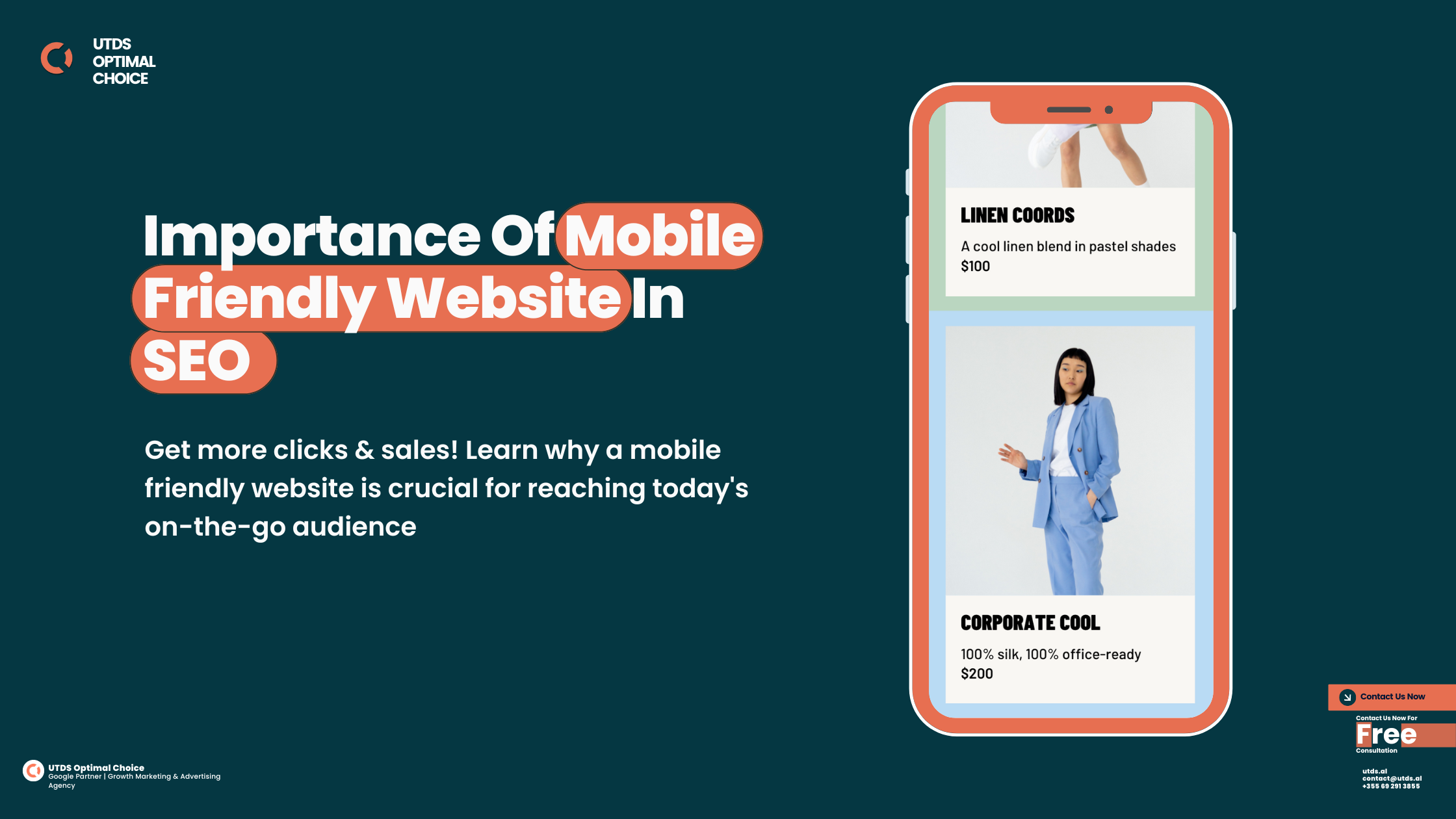
Do you know? Google to Drop Non-Mobile Friendly Websites
Is your website mobile-friendly? Google may remove non-mobile friendly websites from search! Get mobile-optimised now.
Do you ever use your phone or tablet to look things up online? Most people do these days! Phones and tablets are really convenient for searching the internet when you’re not at a computer.
But have you noticed that some websites don’t look quite right or are hard to use on a small mobile screen? That’s because they weren’t made to be mobile friendly. The words and pictures might be too tiny, the menus hard to click, and the pages take forever to load.
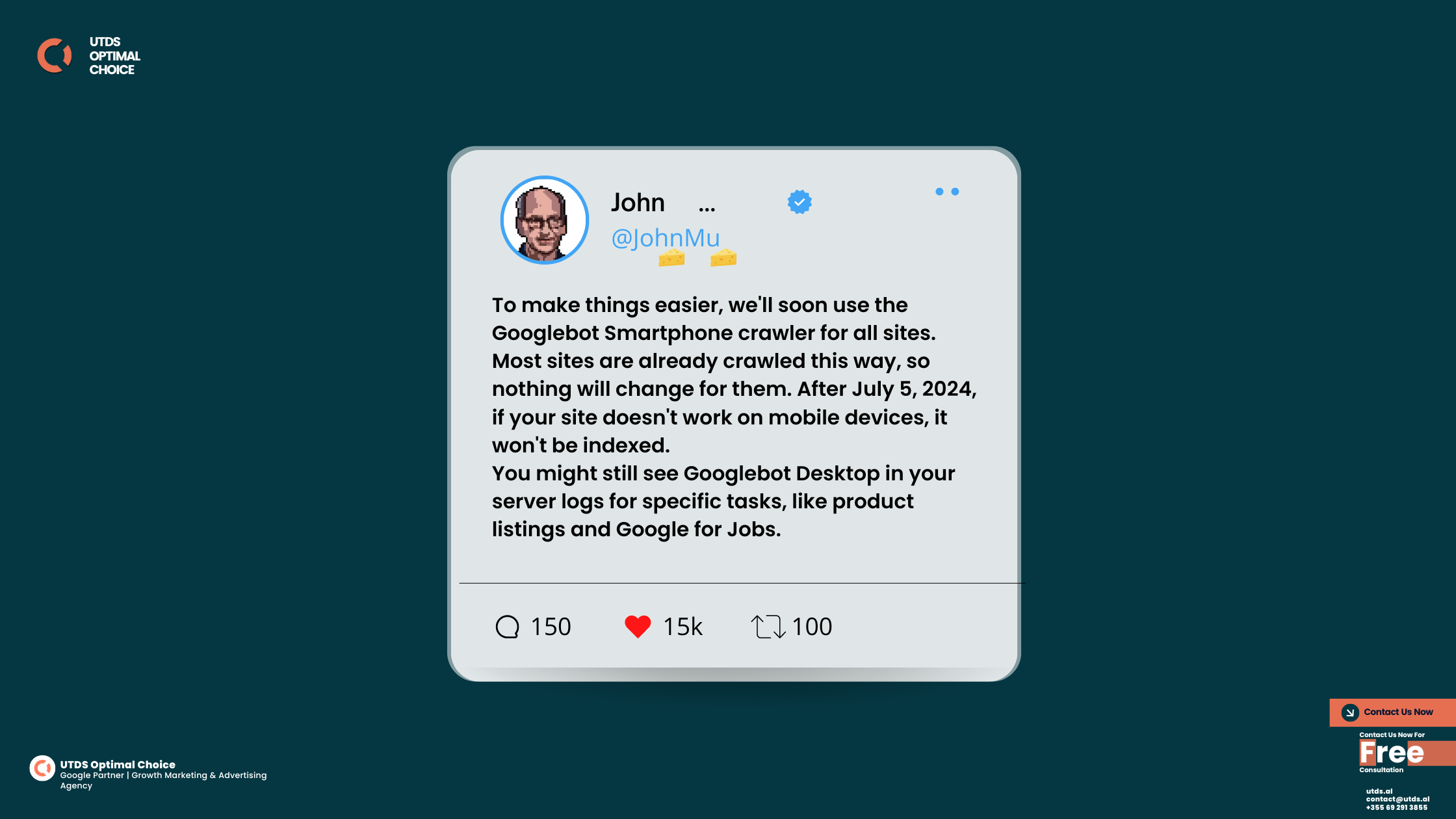
Well, Google has realised this is a big problem. So they’ve decided that starting on July 5th, 2024, they are going to stop indexing any websites that aren’t mobile friendly when people search on their phones or tablets!
Is your website mobile friendly? Don’t risk falling behind! Contact us now to make sure your site meets Google's mobile first standards.
Do you know? Google to Drop Non-Mobile Friendly Websites
These days, more than half of all internet browsing happens on mobile devices like smartphones and tablets instead of desktop computers. Google wants to make sure that when you search on your phone, you can easily view and use the websites that show up. They want you to have a good experience online, whether on a big screen or a small one.
So websites that look bad or are too hard to use on a mobile device won’t be included in Google’s mobile search results anymore after July 5th. That means way fewer people will be able to find your website and fewer website traffic!
What Happens If Your Site Isn't Mobile Ready?
If you have a website that isn’t set up to work well on phones and tablets, then after July 5th it will basically disappear from Google searches done on those mobile devices. That’s really bad because it means tons of people looking on their phones won’t be able to find your site at all.
It will be like your website is invisible to anyone googling on their mobile! You’ll get way less visitors and probably lose out on lots of customers and money. No business wants that to happen!
Think about how many times you and your friends use phones to look something up online. If a website doesn’t work properly on those small screens, you’ll just get frustrated and go somewhere else instead. That’s why mobile friendly website are so important now.
No one wants their website to vanish like that. So it’s really important to get your site mobile-friendly as soon as possible, before Google’s changes happen in just a month.
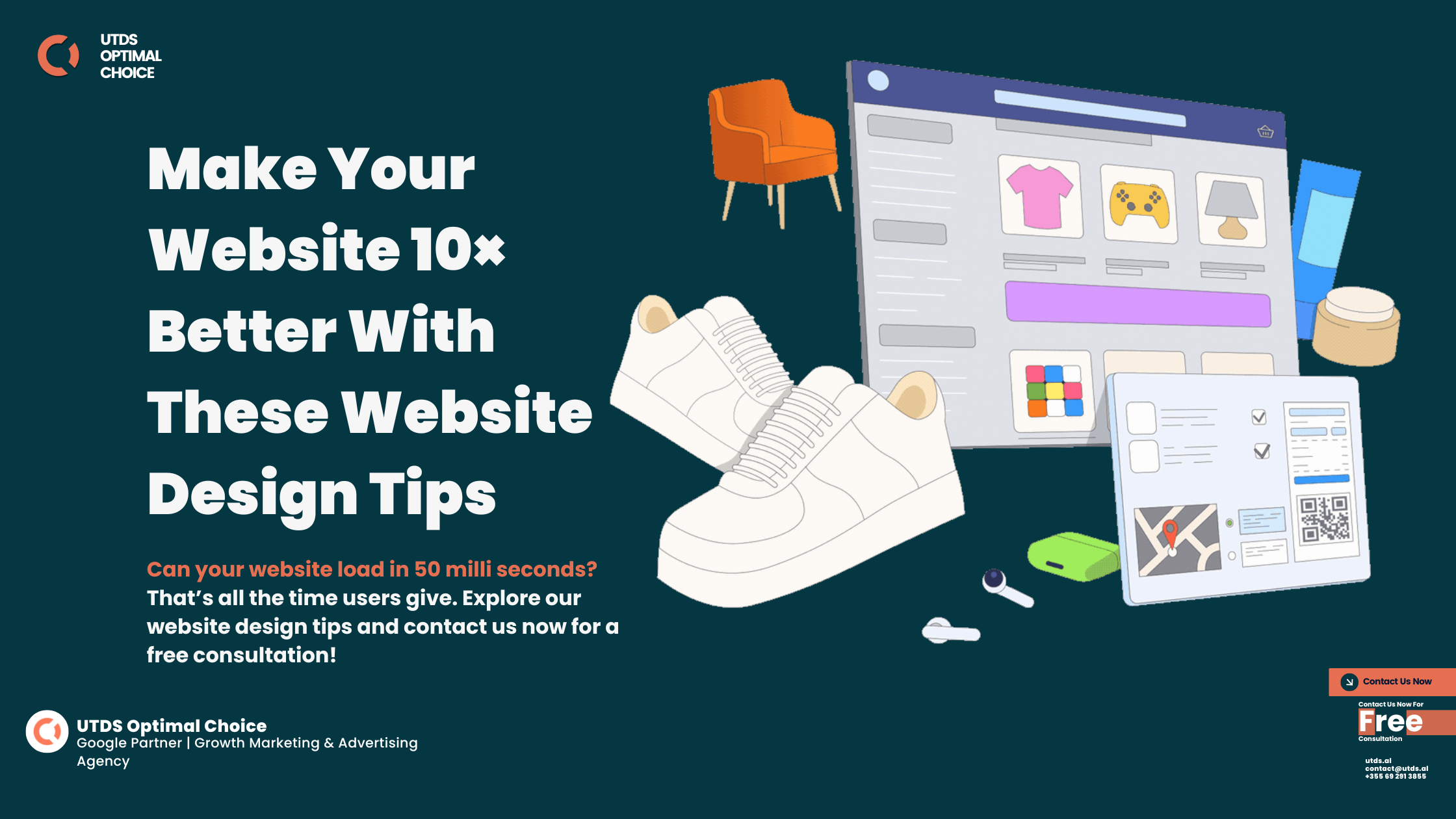
The good news is, there are some pretty simple things you can do to make sure your website look perfect and work great on any phone, tablet, or other mobile gadget:
Make sure your pages load really fast on mobile connections
Use big easy-to-read text and buttons instead of tiny ones
Check that all your images, videos, and other media show up properly
Test how your site looks on various mobile devices like iPhones and Androids
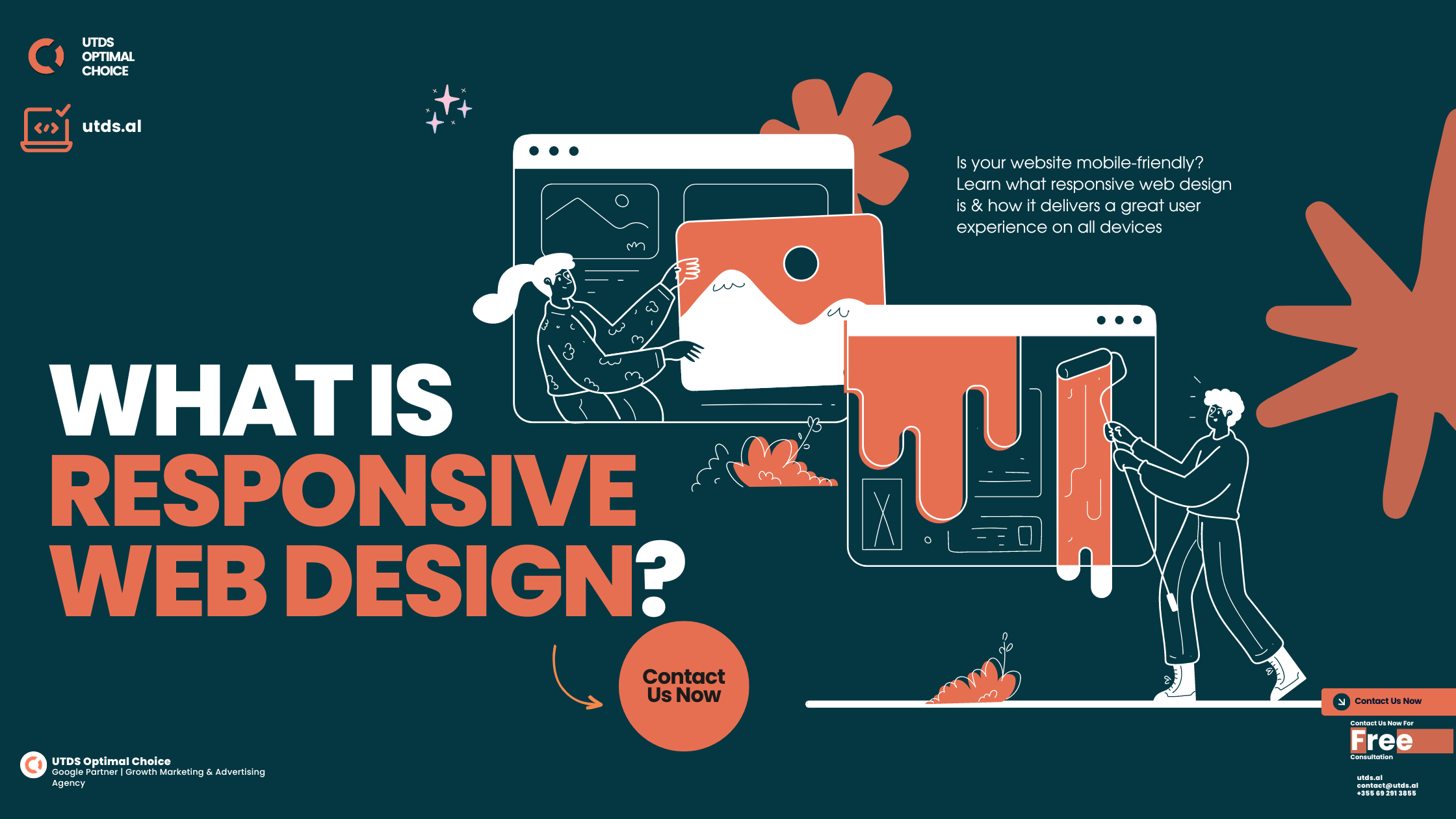
Google has tools you can use to see if your website is truly mobile-friendly or if there are any issues to fix. They really want to help site owners get ready before the changes in July.
Following these tips will ensure your site is SEO optimised for every mobile device out there. That way, anyone visiting on their smartphone or tablet will have no problems at all viewing your full website and all its content.
Staying Mobile-Ready for the Future
Google has realised that more and more of our internet time happens on our portable phones and tablets instead of desktop computers. They call this the “mobile first” world we now live in.
Mobile devices are only going to keep getting more popular for browsing the web, watching videos, reading news, shopping, and everything else online. Google wants to make mobile searching as good as possible.
So this change to stop showing unfriendly mobile sites is a really big deal. If you have a website, you need to make sure it can be properly viewed and used on any mobile gadget. Otherwise, loads of potential visitors and customers won’t even know your site exists when they google on their phones!
Imagine you’re at the park or mall and want to quickly look something up. You pull out your phone to search, but a bunch of the websites that show up are impossible to read or navigate on that tiny screen. You’d just get frustrated and give up, right? That’s exactly what Google is trying to avoid with these mobile rules.
Looking For Free Consultation?
Don’t get left behind on July 5th when Google makes their big mobile website changes. Prep your site to be 100% mobile-ready today! We are UTDS Optimal Choice, a leading agency that specialises in crafting stunning websites and driving successful advertising campaigns. Best of all, we offer FREE consultations to all potential clients.
Our free consultation allows us to carefully assess your current website and marketing efforts, if any. We’ll provide an honest evaluation and recommendations tailored specifically to your business’s needs. Whether you’re an established company looking to revamp your digital presence or a fresh startup preparing to launch online, we’ve got you covered.
So what are you waiting for? Contact us today to schedule your FREE, no-obligation consultation! Let us optimise your web presence for more traffic, leads, and sales.
Ready to take your Mobile Website Design to the next level?
Contact us today for a free consultation and start seeing real results!
