A responsive website design is no longer a feature, it’s a basic requirement. If your site can’t adapt to different screen sizes, you’re losing search visibility, conversions, and user trust.
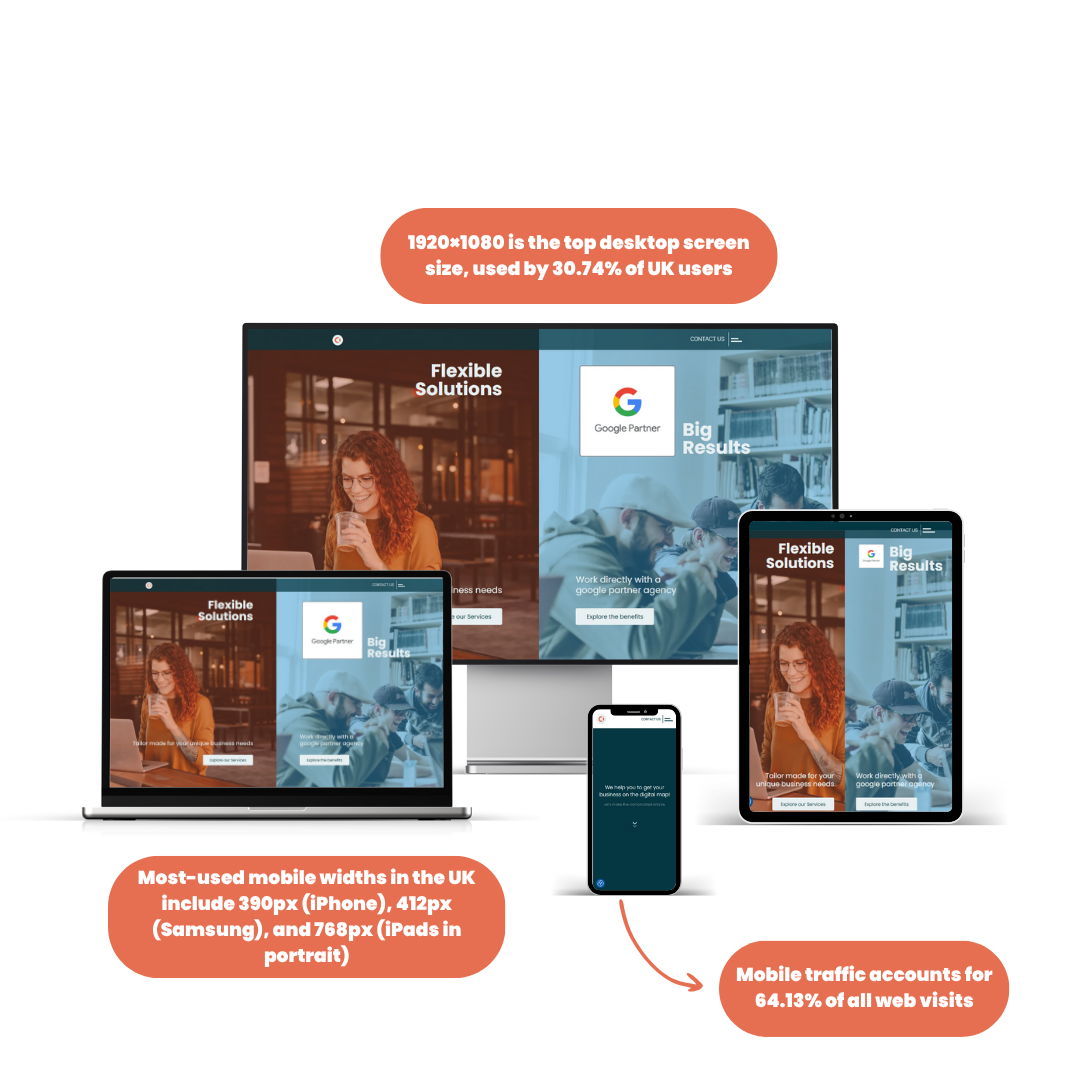
In the UK, more than 64.13% of web traffic now comes from mobile devices. On a desktop, 1920×1080 is the most common resolution, but that’s just part of the picture. Your visitors use iPhones, Galaxy foldables, tablets, widescreens, and smart TVs and they expect your website to work seamlessly on all of them.
A responsive web design adjusts layouts, images, and interactions based on the device. It delivers a consistent experience across screen sizes without building multiple versions of the same site.
For Google, it’s now the standard. Since March 2024, Core Web Vitals use INP (Interaction to Next Paint) instead of FID, tightening the rules on speed and responsiveness. Websites that ignore this drop in rankings, especially on mobile.
In this article, we will break down everything you need to know about responsive website design:
- What responsive web design means in 2025
- How to design for common UK website sizes and mobile breakpoints
- The real difference between responsive and reactive websites
- Why RWD designs outperform fixed and adaptive layouts
- What a responsive homepage looks like with examples from Amazon, Netflix, GOV.UK
- What responsive website designing services cost in the UK
- How to choose the right responsive website company
- Which tools to use, what to test, and how to get it right first time
Whether you’re redesigning, building from scratch, or fixing a mobile issue, after going through this article, it will give you a complete idea about website structure, data, and tools to get your site responsive and ranking.
Ready to take your Website Design to the next level?
Contact us today for a free consultation and start seeing real results!
Want a website that looks great on any device? At UTDS Optimal Choice, we specialise in responsive web design to ensure your site works seamlessly on desktops, tablets, and smartphones. Reach out to us today to create a user-friendly experience that keeps visitors engaged, no matter how they browse.
What Is The Responsive Web Design?
Responsive Web Design means building websites that automatically adjust to fit the screen size of the device being used, like mobile, tablet, desktop, or widescreen. Instead of forcing users to pinch, zoom, or scroll sideways, a responsive website uses flexible layouts, scalable images, and CSS media queries to deliver the right design to the right device at the right time.
A responsive website design isn’t just about visual appeal. It affects speed, navigation, and ranking.
In March 2024, Google updated Core Web Vitals by replacing First Input Delay (FID) with Interaction to Next Paint (INP). Sites that respond slowly to user interaction now get penalised in organic search results. Combined with mobile first indexing, Google now judges your entire site based on its mobile experience, not desktop.
For UK websites, the shift is already visible:
- Mobile traffic accounts for 64.13% of all web visits
- 1920×1080 is the top desktop screen size, used by 30.74% of UK users
- Most-used mobile widths in the UK include 390px (iPhone), 412px (Samsung), and 768px (iPads in portrait)
If your layout breaks or content overflows at these sizes, your site is no longer competitive. Google sees that as poor usability. Users drop off. Rankings drop with them.
Responsive websites:
- Reduce bounce rates on mobile
- Increase session duration across devices
- Improve crawlability and indexing
- Perform better in Core Web Vitals (INP, CLS, LCP)
- Adapt to new devices automatically, without needing a redesign
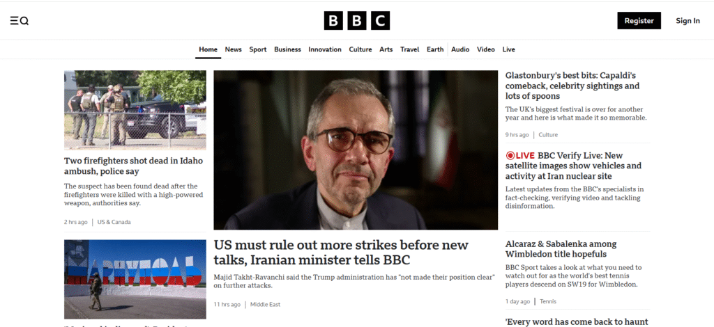
UK organisations like BBC.co.uk, GOV.UK, and NHS.uk have invested heavily in responsive frameworks to meet accessibility, speed, and device coverage targets. Their designs scale from mobile to widescreen while preserving performance, navigation, and SEO structure.
Responsive web design matters in 2025 because it isn’t just a layout technique, it’s the minimum standard for performance, discoverability, and retention across every sector.
If your website isn't responsive, consider a website redesign to ensure a positive user experience across all devices.


What Are Responsive Websites? Key Features Explained
A responsive website is built to function across screen sizes without losing structure, speed, or accessibility. It doesn’t just shrink content. It restructures layout, text, images, navigation, and user interactions to match the device’s capabilities.
Core Features of Responsive Websites:
- Fluid grids: Layouts use percentage widths, not fixed pixels, allowing content to stretch or compress naturally across screen widths.
- Media queries: CSS rules apply specific styles at different breakpoints, such as 480px (mobile), 768px (tablet), 1024px (laptop), and 1280px+ (desktop).
- Responsive images: Images resize or swap based on screen resolution using the srcset attribute, preventing oversized assets from loading on small devices.
- Flexible navigation: Menus collapse into mobile-friendly dropdowns or off-canvas panels, avoiding horizontal scrolling or oversized buttons.
- Viewport meta tag: Sets scale and dimensions for mobile devices (<meta name=”viewport” content=”width=device-width, initial-scale=1″>), critical for accurate rendering.
Responsive web design ensures a smooth user experience across devices, which can lead to increase in website traffic and conversions
Best Responsive Website Design Examples In 2025


Netflix UK
In May 2025, Netflix launched a fully AI-powered responsive homepage. It adapts thumbnail sizes, hero banners, and preview carousels to fit devices as small as 320px and as wide as 1440px. Touch interactions are prioritised on mobile. Hover interactions are preserved on desktop. This ensures zero content overlap and faster loading on slower mobile networks. (Source; Netflix)
Amazon UK
Amazon’s responsive layout uses four key breakpoints: 360px, 768px, 1024px, and 1440px. Product grids adjust column count, navigation switches between icon tabs and full headers, and image zoom is disabled on mobile to improve tap usability. Their layout ensures full accessibility without duplicating page structures across device types. (Source; Browserstack)
GOV.UK
The UK Government Digital Service applies a strict responsive design system with grid-based layouts, scalable typography, and accessibility-tested components. It ensures compliance with WCAG 2.2 and mobile-first performance metrics, including INP under 200ms and CLS below 0.1. (Source; Gov.uk)
Why These Features Are Important;
- Improved load time on mobile due to optimised assets
- Higher Core Web Vitals scores, which now include INP, CLS, and LCP
- Consistent branding across every device
- Better engagement metrics, directly tied to search engine performance
Responsive websites go beyond layout. They integrate adaptive logic, respect bandwidth, reduce unnecessary scripts on mobile, and prioritise tap, scroll, and swipe interactions where relevant. A responsive homepage isn’t just a compressed desktop page, it’s a rebuilt experience.
What Is Responsive Web Design (RWD)
How Responsive Web Design Works: The Core Building Blocks
Responsive web design uses three technical foundations: fluid grids, media queries, and flexible media. These allow a single site to adjust its layout, elements, and content flow depending on screen dimensions, device resolution, and orientation.
1. Fluid Grid Layouts
Instead of using fixed pixel widths, modern layouts apply percentage-based widths. For example:
					.container {
  width: 90%;
  max-width: 1200px;
  margin: 0 auto;
}
This allows layout containers to scale up or down as the viewport changes, without breaking structure.
2. Media Queries
Media queries apply CSS conditionally. They target specific screen widths and apply styles accordingly:
					@media (max-width: 768px) {
  .nav { display: none; }
  .mobile-nav { display: block; }
}
Standard breakpoints used in UK responsive websites (based on real device stats 2025):
- 360px: Small mobiles
- 390px: iPhone 13/14
- 412px: Samsung Galaxy
- 768px: iPad portrait
- 1024px: iPad landscape/laptop
- 1280px+: Desktop and widescreen
3. Flexible Media and Images
Images are made scalable using max-width: 100%, preventing overflow or horizontal scroll. In modern responsive builds:
<img decoding="async" src="image.jpg" srcset="image-small.jpg 600w, image-large.jpg 1200w" sizes="(max-width: 768px) 100vw, 50vw" alt="description">
This instructs browsers to load different images based on screen width, improving load time and Core Web Vitals.
4. Container Queries (2025 Update)
Now supported in 92.44% of browsers (Source; CanIUse), container queries allow components to adapt based on the size of their parent container, not just the viewport. This enables modular, reusable design patterns.
					@container (max-width: 500px) {
  .card { font-size: 14px; }
}
Unlike media queries, which are global, container queries provide precise control inside components. Sites using Tailwind CSS, CSS Grid, and modern design systems are integrating container queries to simplify responsive rules.
Why Is It Important for SEO And UX
- INP (Interaction to Next Paint) targets user responsiveness. Bloated layouts with fixed content or oversized assets increase INP score and degrade rankings.
- CLS (Cumulative Layout Shift) punishes late-loading images or reflowing banners.
- Mobile-first CSS loads faster and reduces unused styles for mobile visitors, improving crawl efficiency.
Responsive web design isn’t a visual trick. It’s a layout system built with scalable logic, performance rules, and user interaction speed in mind. In 2025, a mobile-first, component-responsive structure is the only way to meet Google’s ranking criteria and device diversity demands.
While responsive web design ensures your site looks great on any device, it's still important to understand how to market your business effectively


Responsive vs Non-Responsive Sites: What’s The Difference?
The difference between a responsive and non-responsive website comes down to adaptability, usability, and performance. A responsive website design adjusts layout, content, and behaviour across screen sizes. A non-responsive website design remains fixed, usually built for desktop, forcing mobile users to zoom, scroll sideways, or abandon the page.
Key Differences
| Feature | Responsive Website | Non-Responsive Website |
|---|---|---|
| Layout Scaling | Adjusts fluidly across screen sizes | Fixed dimensions; breaks on small screens |
| Navigation | Adapts (e.g., hamburger menu on mobile) | Unusable or cut-off on small devices |
| Image Handling | Uses srcset, compression, scaling |
Loads full-size desktop assets on all devices |
| SEO Impact | Ranks better (meets Core Web Vitals) | Penalised in mobile search results |
| Development | Single codebase, media queries | Often separate mobile/desktop builds |
| Accessibility | Easier to implement across devices | Requires extra effort or multiple versions |
| Maintenance | Easier; one site to update | Higher; multiple templates or codebases |
Search Impact In The UK
- INP and CLS, two key Core Web Vitals metrics, heavily favour responsive layouts that prevent shift and delay. Non-responsive layouts with fixed widths and large assets increase these scores beyond Google’s recommended thresholds.
- Bounce rates are higher on non-responsive sites. If a mobile visitor encounters broken layout or hard-to-tap elements, the average drop-off time is under 6 seconds.
Device Coverage
UK internet users access websites from:
- iPhone (390–430px viewport)
- Samsung Galaxy (360–412px)
- iPad (768–1024px)
- Desktop screens (1280–1920px+)
A non-responsive website layout designed for 1440px fails instantly on mobile. It creates horizontal scroll, broken navigation, unreadable text, and poor tap targets, all of which impact user experience and SEO.
Why Responsive Web Design Wins
Responsive websites design doesn’t just scale down. They prioritise:
- Load order for mobile
- Tap accuracy
- Font legibility on smaller screens
- Layout containment for component-based design
- CSS specificity to reduce unused code on mobile
The shift from Adaptive Web Design (AWD) to Responsive Web Design (RWD) is now complete. AWD used multiple templates and device detection. RWD uses CSS media and container queries with one flexible layout.
Non-responsive sites built pre-2015 are now obsolete. In 2025, they don’t rank, don’t convert, and don’t comply with accessibility laws in the UK.
Standard Website Sizes in 2025: Designing for Popular Viewports
Designing a responsive website starts with knowing which screen sizes matter. In the UK, user traffic spans from small mobile screens to ultra-wide monitors. Your layout must scale without breaking, shifting, or triggering scrollbars and it must remain readable, navigable, and fast.
What is the most common website size? (UK, May 2025)
UK Desktop Usage (StatCounter) :
- 1920×1080 (Full HD) – 30.74%
- 1366×768 (Laptop Standard) – 15.2%
- 1536×864 (Mid-tier laptops) – 13.4%
UK Mobile Usage:
- 390×844 – iPhone 13/14 series
- 412×915 – Samsung Galaxy S22/S23
- 360×800 – budget Android phones
- 430×932 – iPhone 15 Pro Max
Tablet Usage:
- 768×1024 – iPad portrait
- 834×1112 – iPad Air
- 820×1180 – iPad Pro 11
Your website must accommodate the full range, not just scale to fit, but load efficiently across them.
Optimal Container Widths
- Max-width (desktop containers): 1200px–1440px
Common setup: max-width: 1280px; margin: 0 auto; padding: 1rem - Content width for readability: 60–75 characters per line
Prevents cognitive strain on large monitors - Grid systems: Use 12-column grid for full flexibility; CSS Grid or Flexbox for dynamic arrangements
Viewport Breakpoints For CSS
| Device Type | Common Breakpoint | Usage |
|---|---|---|
| Small mobile | ≤ 360px | Entry-level Android devices |
| Mobile | ≤ 430px | iPhones, Samsung flagship phones |
| Tablet portrait | 768px | iPads in portrait mode |
| Tablet landscape | ≥ 1024px | iPads in landscape mode |
| Desktop | ≥ 1280px | Standard laptops, desktops |
| Widescreen | ≥ 1440px | Monitors, 4K displays |
Use media queries and container queries to control typography, spacing, image scaling, and navigation behaviour at each breakpoint.
File Size And Performance Benchmarks
To stay within Google’s performance budget:
- Page weight should stay under 2MB total, including images, fonts, and JavaScript.
- Image size should be compressed and scaled based on srcset logic. WebP format preferred.
- Font files should be limited to essential styles (e.g. only normal and bold weights).
					img {
  max-width: 100%;
  height: auto;
}
Responsive sites also benefit from:
- Layout stability (low CLS)
- Fast interaction (low INP)
- Compressed media (low LCP impact)
Users bounce if a site doesn’t fit their screen. Google penalises visual instability and delayed interaction. Responsive design doesn’t mean making everything fluid, it means understanding viewport-specific behaviour and adapting layout, spacing, and performance targets for each environment.
Ready to take your Website Design to the next level?
Contact us today for a free consultation and start seeing real results!
Mobile Website Design Best Practices For 2025

With mobile traffic accounting for over 64.13% of total web usage in the UK, mobile web design now determines your site’s visibility, usability, and ranking. A desktop-first site retrofitted for mobile won’t meet performance standards or user expectations.
1. Start With a Mobile-First Layout
Build the layout from the smallest screen up. Write CSS for mobile first, then layer media queries to expand for larger devices.
					/* Mobile-first */
body {
  font-size: 16px;
}
@media (min-width: 768px) {
  body {
    font-size: 18px;
  }
}
Benefits:
- Reduces CSS bloat
- Ensures content prioritisation
- Improves First Contentful Paint (FCP) on mobile
2. Optimise Tap Targets
Buttons and links must have a minimum touch target of 48×48px. Tappable elements should be:
- Not too close together
- Easily visible in direct sunlight
- Large enough for thumb interaction
Poor spacing triggers “tap target too close” warnings in Google Search Console and affects usability scores.
3. Simplify Navigation
Use collapsible menus (hamburgers or icon tabs). Avoid multi-level dropdowns, hover states, or menus that rely on cursor interaction.
Recommended:
- Sticky bottom nav bar for key pages
- Off-canvas sidebar for menu items
- Icon-first, text-second layouts for quick recognition
4. Prioritise Speed
Mobile connections are variable. Design for 4G fallback, not just Wi-Fi.
- Use WebP or AVIF images
- Lazy-load below-the-fold assets
- Remove unused JavaScript on mobile
- Inline critical CSS
INP under 200ms is now a ranking factor. Mobile performance lag is directly tied to lower interaction scores.
5. Avoid Scroll Jank
Scrolling should be smooth, predictable, and free of layout shift. Use:
- overflow-y: scroll for containers
- Predefined image dimensions to prevent shifting
- Skeleton loaders for dynamic content
Google penalises CLS (Cumulative Layout Shift) scores over 0.1. Layouts must be stable as content loads.
6. Design for One-Handed Use
Place key navigation elements within thumb range, bottom left or bottom right depending on language direction.
Test using:
- iPhone SE (small screen)
- Galaxy S23 Ultra (large screen)
- iPad Mini (medium screen)
7. Test on Real Devices
Browser emulators don’t reflect:
- Touch friction
- Load delay on real networks
- Tap accuracy
Use:
- Chrome DevTools + Lighthouse for audits
- BrowserStack or LambdaTest for cross-device testing
- Physical device testing before launch
A mobile website is more than just a smaller version of desktop. It must load fast, interact quickly, and remain readable and functional on all UK relevant mobile viewports. Failing on mobile means failing on search.


How To Choose a Responsive Web Design Company: What To Look For
Not all website agencies deliver truly responsive websites. Many still use outdated themes, ignore performance budgets, or patch mobile layouts as an afterthought. If you’re investing in a redesign or building from scratch, choosing the right responsive website company affects everything, speed, SEO, conversion rate, and long-term maintenance.
1. Check for Mobile-First Builds
A competent provider doesn’t “make it responsive later.” Mobile-first layout must be the foundation. Ask to see their:
- Code samples with mobile-first media queries
- Layout breakpoints used in previous projects
- Mobile Lighthouse scores (especially INP and CLS)
2. Look at Real Device Testing Process
A proper responsive website company tests on:
- iPhone 13, 14, 15 series
- Samsung Galaxy S22/S23
- iPads (landscape and portrait)
- Common UK desktop resolutions (1366×768, 1920×1080)
Ask them how they test:
- Do they use BrowserStack or physical devices?
- Do they deliver screenshots and performance reports per device?
3. Review PageSpeed and Core Web Vitals Reports
Every page must score:
- INP below 200ms
- LCP under 2.5s
- CLS below 0.1
Request recent PageSpeed Insights or WebPageTest reports. If they can’t produce them, walk away.
4. Evaluate Their Work on Live UK Sites
Search for their client work directly. Look for:
- Fast load on mobile (under 3s)
- Clean scaling across viewports
- Use of modern frameworks (Tailwind CSS, CSS Grid)
- Responsive homepage with dynamic banners and reflowing content
5. Ask About Container Query Support
Responsive website designing services must now include container query integration. As of 2025, 92.44% of browsers support container queries. This allows component-based responsiveness, essential for modern UI systems. (Friendly Intro To Container Queries)
If the provider doesn’t support container queries, their approach is outdated.
6. Prioritise UK-Based Experience
UK websites must meet:
- Accessibility laws (WCAG 2.2)
- GDPR compliance for mobile forms and cookies
- Fast rendering across UK ISPs and mobile carriers
Local providers understand these requirements better than offshore template vendors.
7. What a Professional Provider Will Offer
- Custom RWD design (not just a mobile plugin)
- Core Web Vitals optimisation
- Device testing reports
- SEO-ready structure
- Clear pricing for layout, development, testing, and launch
Example: UTDS Optimal Choice
At UTDS Optimal Choice, we build responsive websites tailored for UK businesses, mobile-first, Core Web Vitals optimised, INP-compliant, and scalable across all devices. Our client sites run under 2MB total weight, pass PageSpeed audits, and use container query frameworks by default.
What Is the Cost Of A Responsive Website In The UK? (2025 Breakdown)
Responsive website design costs in the UK vary widely, from single-page builds to enterprise-level platforms. The price depends on complexity, content, responsiveness depth, and backend integration. In 2025, UK businesses are paying between £400 and £30,000+ for responsive website designing services (Sources; Goldenegg, Goodfirms).
Cost Factors to Consider
Responsive Complexity
- Custom breakpoints vs standard templates
- Tailored navigation behaviour on mobile
- Interactive components (e.g. dynamic forms)
Performance Requirements
- INP tuning under 200ms
- Optimised mobile media handling
- PageSpeed compliance for every template
Framework and Tech Stack
- React, Tailwind CSS, or Next.js add cost but improve scalability
- Older stacks like Bootstrap v3 increase mobile bloat
Device Testing
- Professional agencies test across real UK devices (iPhone, Samsung, iPad)
- Budget providers skip responsive audits
After-Launch Support
- Ongoing maintenance for responsive updates
- Content scaling and responsive performance checks
Red Flags When Buying Responsive Design
- Agencies offering “responsive add-ons” for £99, usually patched templates
- Non-itemised invoices without device testing or INP performance
- No reference to Core Web Vitals or mobile indexing requirements
- No mention of srcset, lazy loading, or responsive image formats
Smart Cost-Saving Strategy
Choose a provider that uses:
- Mobile-first CSS architecture
- Container query support
- Performance-first image handling
- Reusable responsive components
This ensures a future-proof website that won’t require a full rebuild next year.
Reactive Website vs Responsive Website: What’s the Difference?
Responsive and reactive websites are not the same. While both aim to improve user experience, they serve different functions.
Responsive Website Design
A responsive website adapts its layout, content, and visual elements based on screen size and device resolution. It ensures the site looks and functions properly on mobile, tablet, and desktop using:
- Media queries
- Fluid grids
- Responsive images
- Mobile first layout rules
Responsive web design is essential for:
- Cross-device compatibility
- Meeting Core Web Vitals thresholds (INP, LCP, CLS)
- SEO performance under Google’s mobile-first indexing
Examples:
Reactive Website Design
A reactive website responds to user input or data changes in real-time, not just device conditions. These websites rely on JavaScript frameworks like React, Vue, or Angular to update content dynamically without reloading the page.
Reactive sites are used in:
- Web apps
- SaaS dashboards
- Real-time booking portals
- Streaming platforms
Features of reactive websites:
- State-based UI rendering
- Component-level updates
- API data binding
- Instant content refresh on user interaction
Examples:
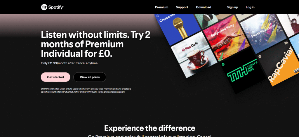
- Spotify Web App: Music updates without reload, layout reflows with each interaction
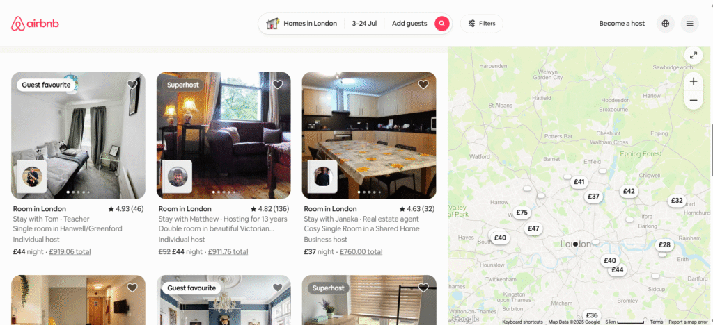
- Airbnb: Filters, calendars, and listings update live as the user selects options
Combined Use
Many modern websites use both:
- Responsive layout for screen flexibility
- Reactive components for live interactivity
For example, Netflix UK has a fully responsive homepage and reactive elements that adjust as users scroll or interact with carousels, both built to deliver speed and adaptability.
A responsive website ensures content fits the device. A reactive website ensures the content responds in real-time to the user’s actions. For business websites, eCommerce, and service pages, responsive design is essential. Reactive logic is optional and only relevant where dynamic updates are critical.
Tools & Frameworks To Build Responsive Websites
Responsive website design isn’t achieved with guesswork. In 2025, building a scalable and mobile-ready layout requires reliable frameworks, testing platforms, and performance-first design systems.
Below are the most widely used tools for building responsive websites that pass Core Web Vitals and adapt to all major UK devices.
1. Tailwind CSS (Framework)
A utility-first CSS framework that supports:
- Mobile-first breakpoints
- Built-in responsive modifiers (e.g. md:, lg:)
- Container query support
- Optimised build output (Tree-shaking, JIT)
Use Tailwind to create responsive components without writing custom media queries. Popular for startups, SaaS sites, and modern WordPress/Next.js frontends.
2. CSS Grid + Flexbox (Native Layouts)
CSS Grid is the most precise tool for layout control, supported in all modern browsers. Flexbox is ideal for smaller component-level layout adjustments.
Both are critical in responsive site architecture:
- Grid defines scalable structure
- Flexbox handles flexible child alignment
Combine them with container queries to handle layout logic inside components, not just across the page.
3. Bootstrap 5
Still widely used, Bootstrap 5 supports responsive classes, grid breakpoints, and mobile-first structure. However, it’s heavier than Tailwind and less customisable without overrides. Best suited for rapid prototyping and CMS-integrated builds.
4. Container Queries (Browser-Native)
As of June 2025, 92.44% of global browsers support container queries. They allow components to adapt based on the size of their parent — not just the viewport.
This is essential for:
- Sidebar widgets
- Product cards
- Reusable layout blocks
					Example:
@container (max-width: 500px) {
  .card-title {
    font-size: 14px;
  }
}
5. Responsively App (Testing Tool)
Desktop app for previewing websites in multiple screen sizes at once. Includes device presets (iPhone, Galaxy, iPad, laptops), sync scroll, and live reload.
Use this to visually audit your responsive homepage during development.
6. Chrome DevTools (Performance Auditing)
DevTools includes:
- Responsive mode preview
- Lighthouse audits (INP, CLS, LCP)
- Coverage reports for unused CSS/JS
- Network throttling for 3G/4G testing
Use it before publishing any responsive design. Fix flagged layout shift, unused code, and large asset sizes.
7. BrowserStack & LambdaTest (Cross-Device Testing)
Cloud-based testing environments for checking real-world layout rendering across UK-targeted devices:
- iPhone 13/14/15
- Galaxy S22/S23
- iPad Mini, Air, Pro
- Desktop resolutions from 1366px to 2560px
Essential for validating responsive layout and touch behaviour across OS versions.
8. PageSpeed Insights & WebPageTest (Performance Tools)
These tools grade mobile load speed and Core Web Vitals compliance.
Key responsive metrics:
- INP: under 200ms
- LCP: under 2.5s
- CLS: under 0.1
- Mobile usability: zero tap target or viewport errors
Use test results to refine responsive images, script order, font loading, and layout containment.
If your website doesn’t use Tailwind, container queries, real device testing, or Web Vitals auditing, it’s not ready for mobile search in 2025.
Responsive website designing services must go beyond breakpoints. They require clean, flexible layout logic, optimised media handling, and tool-based performance validation to stay competitive in the UK market.
Need A Responsive Website That Loads Fast, Ranks Well, And Works Everywhere?
In 2025, a responsive website is not optional, it’s your foundation for visibility, performance, and growth. If your site fails to adapt to mobile, it fails to rank. If it fails to meet Core Web Vitals, it loses traffic. If it ignores responsiveness, it loses users across every screen.
UTDS Optimal Choice builds responsive websites for UK businesses that meet the exact requirements covered in this guide:
- Mobile-first architecture using Tailwind CSS and container queries
- Performance-tuned layouts tested across iPhone, Galaxy, iPad, and desktop resolutions
- Full Core Web Vitals compliance: INP under 200ms, LCP under 2.5s, CLS below 0.1
- Fully scalable design systems ready for eCommerce, lead generation, and public sector applications
Every site is tested on real devices. Every asset is compressed and optimised. Every layout is built for speed, usability, and SEO from the first line of code.
If you’re serious about building a responsive website that ranks and performs across all devices, contact us now.
Request a free consultation now.
Everything Else You Need to Know About RWD in 2025
What does “responsive website” mean?
A responsive website automatically adjusts its layout, images, fonts, and components based on the user’s screen size and resolution. It provides a consistent experience across mobile, tablet, and desktop without separate designs.
What is meant by responsive web design?
Responsive web design (RWD) is a CSS-based layout strategy that uses fluid grids, media queries, and flexible images to adapt website content across devices. It eliminates the need for zooming or horizontal scrolling.
What are responsive websites?
Responsive websites are designed to function across all device types. They scale content dynamically to match screen dimensions, ensuring fast load, readable text, accessible navigation, and stable layout across all viewports.
What is a web page design?
Web page design refers to the visual structure, layout, and user interface of a single page within a website. In responsive design, each page is built to reflow and adjust elements based on screen size and orientation.
What is the difference between responsive and normal websites?
A normal (fixed-width) website remains the same size regardless of screen, often breaking on mobile. A responsive website adapts using CSS rules to fit each device, improving usability and mobile SEO performance.
What is an example of responsive design?
Amazon UK’s homepage is a responsive layout. It resizes product cards, repositions filters, and adjusts navigation across smartphones, tablets, and desktops using media queries and flexible containers.
What are the three basic things required for responsive web design?
- Fluid grids using percentage-based widths
- CSS media queries with screen-specific breakpoints
- Flexible images that scale with screen resolution
What is RWD in web design?
RWD stands for Responsive Web Design. It is the standard method for building layouts that work on all devices using CSS breakpoints, flexible containers, and mobile-first principles.
What is the RWD?
The RWD method applies a mobile-first strategy using:
- Base styles for small screens
- Progressive enhancements for larger screens via media queries
- Dynamic content scaling across viewports
What is AWD design?
AWD stands for Adaptive Web Design. Unlike RWD, it uses multiple fixed templates for different screen sizes. Each template loads based on detected device type. It’s less flexible and harder to maintain.
What is the difference between AWD and RWD web design?
RWD uses a single layout that adjusts with CSS. AWD uses multiple layouts selected based on device type. RWD is easier to maintain and better for SEO. AWD is used where device-specific experiences are needed.
How much does a responsive website cost?
In the UK, responsive website design costs between £400 and £30,000+ depending on complexity, features, and performance requirements. Prices vary by agency, CMS, and level of testing.
Is Netflix a responsive website?
Yes. Netflix UK redesigned its homepage in May 2025 with responsive layout principles. It scales banners, previews, and menus across all device sizes using container queries and adaptive streaming UI.
Is Amazon a responsive website?
Yes. Amazon’s entire site uses a responsive layout. Pages adapt across mobile and desktop using breakpoints, dynamic menus, and mobile-first layouts to ensure seamless browsing and checkout.
What is the standard size of a website?
There is no fixed standard. However, responsive websites usually set container max-widths between 1200px–1440px for desktop, and use fluid widths for smaller screens. The most common UK screen resolution is 1920×1080.
Are websites 1920×1080?
1920×1080 is the most common screen resolution in the UK (30.74% share). But a responsive website should not be designed to this size only. It must scale from 360px to 1440px+ for full device coverage.
What is a good file size for a website?
In 2025, total page size should stay under 2MB, including scripts, images, fonts, and video. Sites exceeding this slow down on mobile and get penalised under Core Web Vitals (LCP, INP).
Ready to take your Website Design to the next level?
Contact us today for a free consultation and start seeing real results!


