Website design isn’t just visual polish, it’s a conversion engine. With mobile traffic accounting for 64.13% of all web visits in the UK, your homepage layout, responsiveness, and content hierarchy now determine whether users stay or leave within seconds. On desktop, 1920×1080 remains the most used screen size, holding 30.74% share among UK visitors, making grid-optimised, resolution-aware design a practical necessity.
In this article, we will share about the website design tips grounded in usability, accessibility, and speed. Every layout decision, spacing rule, and interaction method discussed here directly improves how users experience your site and how search engines rank it. Whether you’re refining a single landing page or planning a full website redesign, these website design tips are tailored to modern UK expectations, responsive layout standards, and measurable SEO impact.

At UTDS Optimal Choice, we create SEO-optimised, high-converting websites designed to boost your business. From website speed optimisation to on page SEO strategies, we ensure your site delivers both traffic and conversions. Let’s start transforming your website! Contact us today for a free consultation and let us help you build a website that grows your business.
What Makes A Good Website Design?
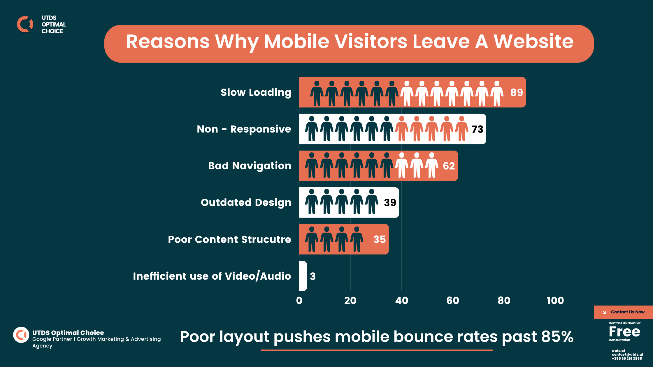
A good website design delivers structure, speed, and trust. In the UK, 94% of first impressions relate to web design, and poor layout pushes mobile bounce rates past 85%. Users leave within seconds if the site looks unstructured or slow.
Use a grid-based web designing layout. Align spacing, limit fonts to two, and scale layouts by device, fluid columns on mobile, multi-card sections on widescreen. Add alt-text, semantic HTML, and accessible markup to meet modern search standards.
Google’s INP benchmark requires interactions under 200ms. Slow buttons, menus, or image carousels damage both UX and ranking. Effective website design advice isn’t visual, it’s structural. Fast, readable, responsive pages perform better.
What Are The 5 Golden Rules Of Web Design?
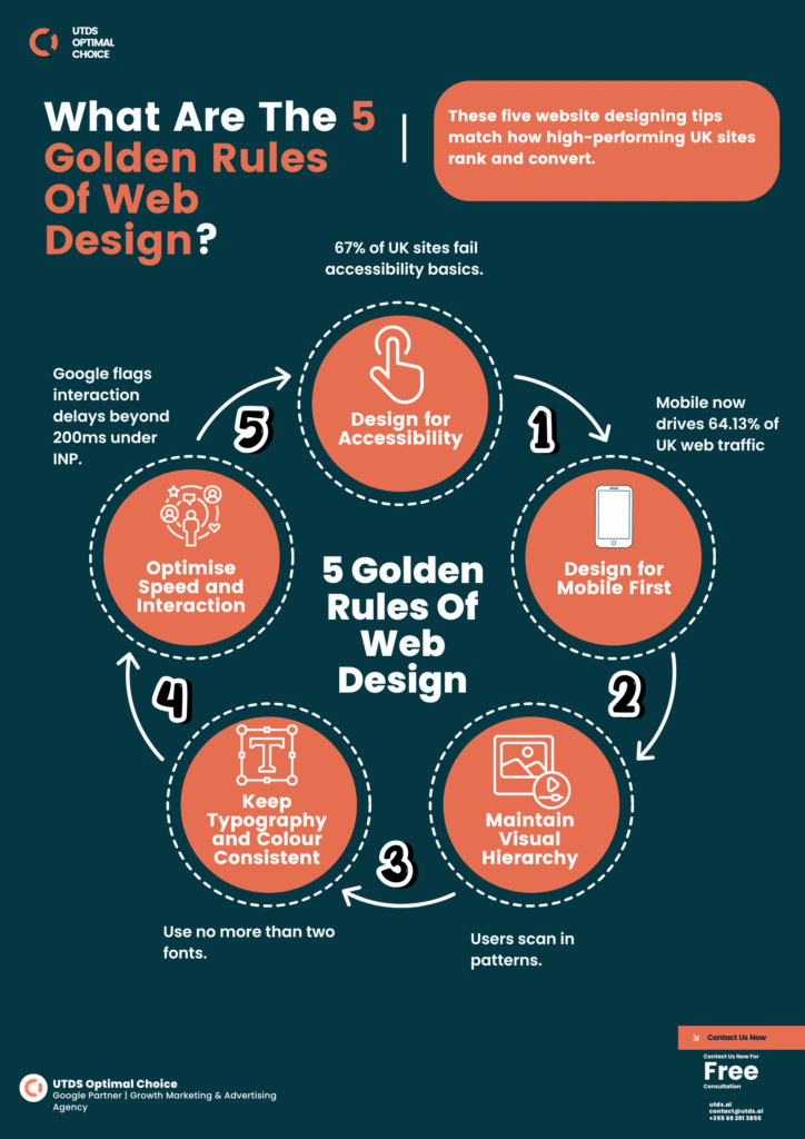
Professional websites follow structure, not just style. These five website designing tips match how high-performing UK sites rank and convert.
- Design for Mobile First
Mobile now drives 64.13% of UK web traffic. Use breakpoints at 360px to 430px, single-column layouts, collapsible menus, and WebP images. Mobile-first CSS prevents layout failure. - Maintain Visual Hierarchy
Users scan in patterns. Place headers, subheadings, and CTAs top-left to bottom-right. Use H1 at 32px, body at 16px, and 24 – 32px spacing to improve how people read website design quickly. - Keep Typography and Colour Consistent
Use no more than two fonts. Follow a fixed scale and WCAG 2.2 contrast ratio of 4.5:1+. Consistency reduces user friction and boosts accessibility SEO signals. - Optimise Speed and Interaction
Google flags interaction delays beyond 200ms under INP. Keep page size under 2MB, compress all media, and strip unused code. Speed isn’t optional, it decides ranking. - Design for Accessibility
67% of UK sites fail accessibility basics. Use semantic HTML, clear labels, working keyboard navigation, and proper colour contrast.
These are not web design trends, they’re performance rules. Apply them to every web designing layout to increase visibility, reduce drop-offs, and meet modern SEO benchmarks.
What Are The 7 Major Steps To Designing A Webpage?
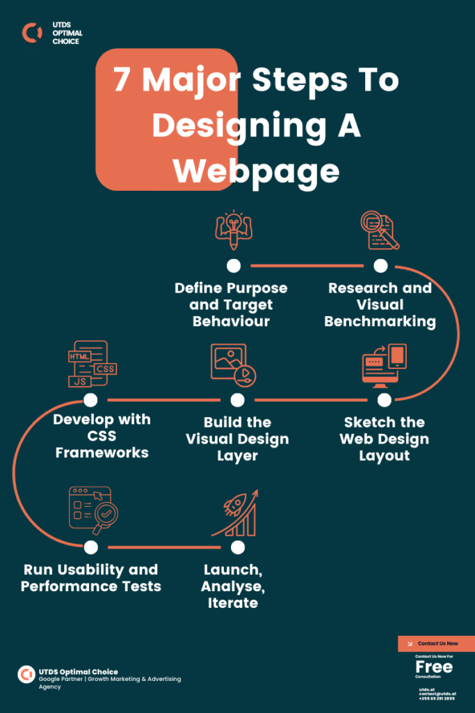
Designing a webpage is not guesswork. It’s a structured process that balances layout, speed, and function. Following these seven steps helps prevent inconsistency, layout clutter, and interaction issues, backed by proven website design advice used by UK developers.
- Define Purpose and Target Behaviour
Clarify what action each page should drive click, scroll, or sign-up. One overlooked website design tip is skipping this stage. No goal, no conversion. - Research and Visual Benchmarking
Use tools like BuiltWith and Similarweb to analyse top layouts. Screenshot and dissect structures, recreate three of your favourite layouts from scratch. You’ll learn 10× faster. - Sketch the Web Design Layout
Start with wireframes using a 12-column grid. Match layout to device breakpoints: ≤768px (tablet), ≥1024px (desktop), ≥1440px (widescreen). Structure first, styling later. - Build the Visual Design Layer
Use Figma or Adobe XD. Keep fonts and spacing consistent. Avoid overload, good layout should be scannable. This is where reading website design structure becomes intuitive. - Develop with CSS Frameworks
Use Tailwind CSS or Bootstrap. Write semantic HTML. Set base font to 1rem, scale up using em units. This supports responsive layouts and accessibility. - Run Usability and Performance Tests
Check responsiveness, contrast, and INP timing using Lighthouse and PageSpeed Insights. A layout that lags, even if it looks clean drops in organic rank. - Launch, Analyse, Iterate
Use Hotjar and GA4 to track scroll depth, CTA clicks, and user drop-offs. Refine layout where engagement stalls.
These seven actions form reliable website designing tips that reduce layout failure, improve UX, and increase organic visibility across devices.

Web Designing Layout: What Works in 2025
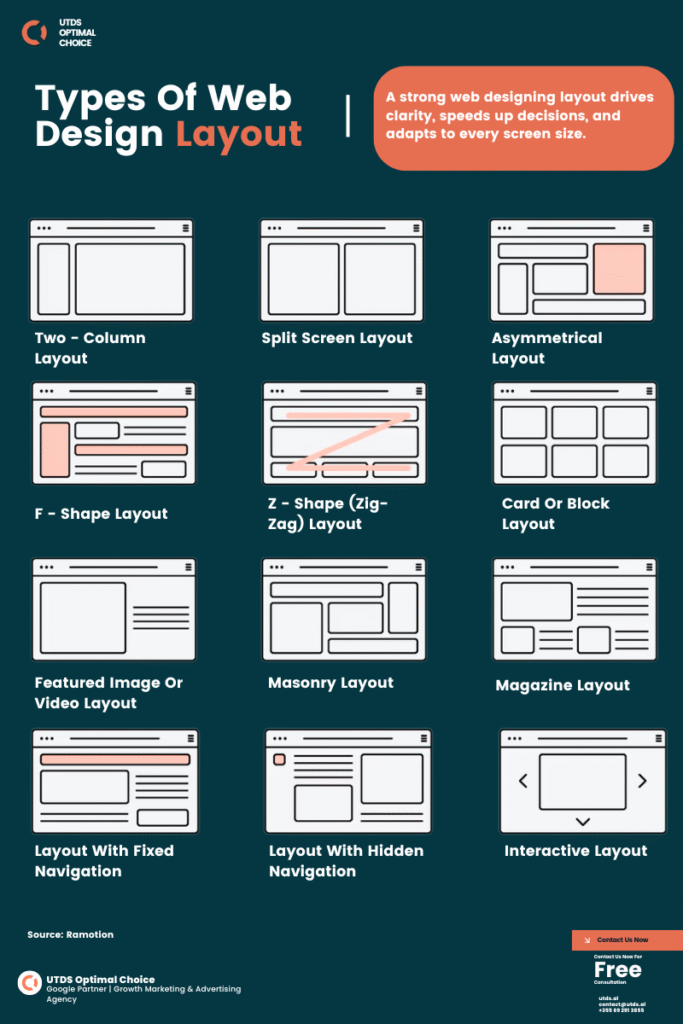
A structured web design layout doesn’t just organise content, it shapes user behaviour. Poor structure leads to fatigue, high bounce rates, and lost conversions. A well-built web designing layout improves focus, responsiveness, and visual trust.
UK users browse across multiple breakpoints:
- 390px – 430px (mobiles)
- 768px (tablets)
- 1280px (laptops)
- 1440px+ (widescreens)
Layouts must adapt fluidly across all screen sizes. That means dropping fixed-width wrappers and using CSS containers, media queries, and Flex/Grid systems for structure.
The most dependable website design tip for layout planning is to start with a 12-column grid. This gives modular control across devices. Build around section blocks header, hero, content, CTA, and footer using vertical spacing in 8px or 10px increments.
Popular Layout Patterns
| Layout Type | Best Use Case | Description |
|---|---|---|
| F-pattern | Blogs, news articles | Aligns content left; supports natural reading flow |
| Z-pattern | Landing pages, CTAs | Guides attention in zigzag through action points |
| Grid layout | Products, services | Uniform cards that stack well on smaller screens |
A strong web designing layout drives clarity, speeds up decisions, and adapts to every screen size. That’s not a visual bonus, it’s structural performance.
What Are The 4 C's Of Website Design?
The best-performing UK websites follow structural rules, not trends. The 4 C’s of website design define how clarity, consistency, contrast, and content shape a layout that performs across devices.
1. Clarity
Pages must deliver one goal, one message, one CTA. Use clean fonts, white space, and structured hierarchy. Avoid overlapping sections or colour noise. When users can’t locate the next step, bounce rates spike. This website design tip improves both usability and conversion.
2. Consistency
Layout consistency builds trust. Fonts, spacing, and button styles must match across all devices. Use global design systems with fixed paddings (24px between content blocks, 16px around UI elements). Misaligned navigation or shifting CTAs break user flow, common in failed website designing tips.
3. Contrast
A readable layout needs proper contrast. Follow WCAG 2.2 with minimum 4.5:1 contrast ratio. Avoid light-grey text on white or yellow CTAs on pale backgrounds. Stick to the 60 – 30 – 10 colour rule and apply bold weights for headings. Strong contrast improves mobile readability and visual focus.
4. Content
Design supports content, not the reverse. Keep headlines short (6 – 10 words), lines under 80 characters, and use semantic HTML: <h1> for titles, <h2> for structure, <p> for text. Set line height to 1.5 – 1.75. These aren’t just web design tips, they’re signals for search engines to prioritise your content.
A layout built on these 4 C’s guides users effortlessly. It improves structure, reinforces SEO, and turns website design advice into results.
Ready to take your Website Design to the next level?
Contact us today for a free consultation and start seeing real results!
Make Your Website 10× Better With These Website Design Tips
How To Design A Website For Beginners
Most beginners focus on visuals first, but structure matters more. Layout clarity, grid systems, and speed outperform decorative design. Learning how to design a website starts with layout, not colour.
No-code tools like Wix, Webflow, or Squarespace work, if they allow full control over spacing, responsiveness, and layout. Avoid website templates bloated with scripts. These slow down performance and harm SEO.
Apply baseline website design tips:
- Max container width: 1140px with auto margins
- Use a 12 – column grid with 24px gutters
- Layout flow: header → hero → content → CTA → footer
- Font sizes: 16px body, 24px subheadings, 32 – 48px H1 (rem/em units)
- Limit colour palette to 2 – 3 high-contrast tones
For responsiveness:
- ≤430px for phones
- 768px for tablets
- ≥1024px for desktops
Beginners should reverse – engineer top-performing pages. Screenshot layouts, map their structure in Figma, and rebuild using basic CSS or Webflow.
When content fits the layout and speed meets Core Web Vitals, even beginner sites outperform cluttered themes. Ignore design trends. Follow systems. That’s the foundation of real website design advice.
What Are Do's And Don'ts For Designing A Nice Looking Website, When You Are Not Design Savvy
You don’t need design experience to build a professional website. Most layout failures come from inconsistent spacing, too many fonts, or visual clutter. But with the right website design tips, non-designers can build clean, usable layouts that earn trust.
Do’s
- Use a grid layout: Stick to column-based designs, max width 1140px, with even padding.
- Limit fonts and colours: No more than two font families, one accent colour.
- Maintain vertical spacing: Keep it consistent – 32px between sections, 16px between lines.
- Improve readability: Paragraph width should not exceed 80 characters. This supports better reading website design flow.
- Repeat patterns: Use the same buttons, headers, and icon styles site-wide.
Don’ts
- Don’t centre-align body text: It breaks scan rhythm.
- Don’t use oversized headers or autoplay banners: They hurt performance.
- Don’t rely on stock images: Use compressed visuals with srcset for mobile.
- Don’t skip accessibility: No colour-only indicators, and always include alt-text.
For anyone without design training, layout comes before visuals. Get the structure and spacing right, then apply colour. These website designing tips aren’t creative hacks. They’re layout systems that improve consistency, speed, and usability.
Advanced Web Design Tips: Responsiveness, Speed, Accessibility
Design without performance fails. A professional layout must scale across devices, load under 2 seconds, and work for every user. These are not extras, they are required standards in website design advice for 2025.
Responsiveness
Responsive sites adapt fluidly, not just shrink. Use breakpoints at:
- ≤430px (mobiles)
- 768px (tablet)
- ≥1024px (desktop)
- ≥1440px (widescreen/4K)
Trigger layout shifts using CSS media queries and grid systems. Replace fixed widths with % or vw, and add the correct viewport meta tag:
<meta name=”viewport” content=”width=device-width, initial-scale=1″>
Menus should collapse into icons. Sidebars drop into expandable drawers. Cards stack vertically on mobile. That’s a responsive structure, not just mobile scaling.
Speed
Page speed affects ranking. Google’s INP standard requires interactions under 200ms. To meet that:
- Compress images with WebP or AVIF
- Lazy load below-the-fold content
- Remove unused CSS/scripts
- Avoid autoplay carousels
Keep full page size under 2MB, including all fonts and JavaScript. Test speed using Lighthouse, GTmetrix, and Chrome DevTools. Speed is not a bonus, it’s a website design tip tied to search visibility.
Accessibility
In the UK, 67% of websites fail accessibility audits. Fix it by:
- Using semantic HTML (<nav>, <main>, <footer>)
- Applying logical heading structure (<h1> to <h3>)
- Supporting reading website design with screen readers
- Enabling full keyboard navigation
- Meeting WCAG 2.2 contrast ratios (e.g. black on white = 21:1)
These website designing tips aren’t advanced, they’re baseline. Fast, scalable, accessible layouts now define whether your site ranks or vanishes.
Website Design Advice for 2025 - Let UTDS Optimal Choice Build It Right
If your site still relies on outdated templates, slow mobile layouts, or confusing structure Google has already noticed. A professional website design layout isn’t about trends. It’s about grid-based design, Core Web Vitals compliance, and clarity that keeps users engaged across every screen.
UTDS Optimal Choice builds responsive websites designed for performance, search visibility, and long-term scalability. Whether you’re starting fresh or rebuilding a legacy layout, we implement every principle outlined above mobile first, grid-aligned, fast-loading, and SEO-optimised.
Our UK-based team works directly with businesses across professional services, trades, and retail. We design custom layouts using data, user behaviour, and clear conversion goals. We don’t use bloated themes or third-party templates; we design, build, and optimise everything to meet modern layout standards.
Looking for practical, expert-led website design with technical execution that ranks?
Start with a performance audit or layout consultation from us. Contact us now.
FAQs Based On Real UK Search Queries
What is a web design layout?
A web design layout is the structural framework that organises your content visually. It includes containers, rows, columns, padding, and responsiveness rules. Choosing the right layout F-pattern, Z-pattern, or grid is central to reading website design effectively.
What is the best layout for a website?
No layout fits all, but for UK business and service sites, a mobile-first grid layout with sticky navigation and section-based scrolling performs best. For content-heavy pages, the F-pattern guides scanning naturally.
What is the basic structure of a web design?
Header, hero section, main content, call to action, and footer. This structure applies across device types. Each block should sit inside a grid and follow consistent spacing rules. It’s the base of every strong web designing layout.
Reddit Threads Worth Reading
Reddit remains one of the most practical sources of raw feedback, layout critiques, and beginner questions on website designing tips. These threads offer insight into how real users and developers solve layout issues, improve readability, and structure content for mobile and desktop.
🔗 “How do you approach structuring and styling a layout from scratch?” – r/UI_Design
🔗 “Beginner Web Design Tips That Actually Helped Me” – r/webdev
Ready to take your Website Design to the next level?
Contact us today for a free consultation and start seeing real results!