To create a dashboard with multiple charts, you must first ensure you have the underlying source reports saved in a folder that is accessible to the dashboard. A single dashboard can contain up to 20 different components (charts, tables, or metrics).
Step 1: Create the Dashboard Container
- Use App Launcher, navigate to the Dashboards tab in your navigation bar.
- Click the New Dashboard button.
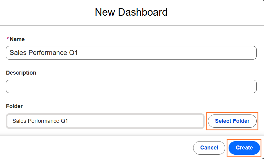
- Name: Enter a descriptive title (e.g., Sales Performance Q1).
- Folder: Choose a folder. If you want others to see it, do not save it in “Private Dashboards.”
- Click Create.
Step 2: Adding Chart Components
Once the blank canvas opens, you can begin adding your visual data:

- Click the + Widget button.
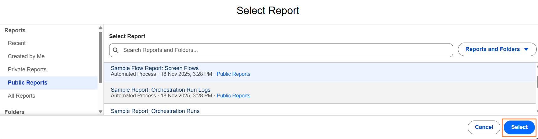
- Select Report: Choose the source report you want to visualize.
- Note: The report must be a Summary or Matrix report to display as a chart.
- Select Chart Type: On the left side of the “Add Component” window, choose your visualization:
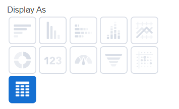
- Bar/Column Chart: Best for comparing values (e.g., Sales by Rep).
- Donut/Pie Chart: Best for showing proportions (e.g., Lead Source Breakdown).
- Funnel Chart: Best for showing stages (e.g., Opportunity Pipeline).
- Gauge: Best for tracking progress against a goal (e.g., Revenue vs. Quota).
- Configure Attributes: Set the X-axis, Y-axis, and Legend. You can also toggle “Show Values” to display the exact numbers on the bars.
- Click Add.
Step 3: Organizing the Layout
Salesforce uses a flexible grid system for dashboards:
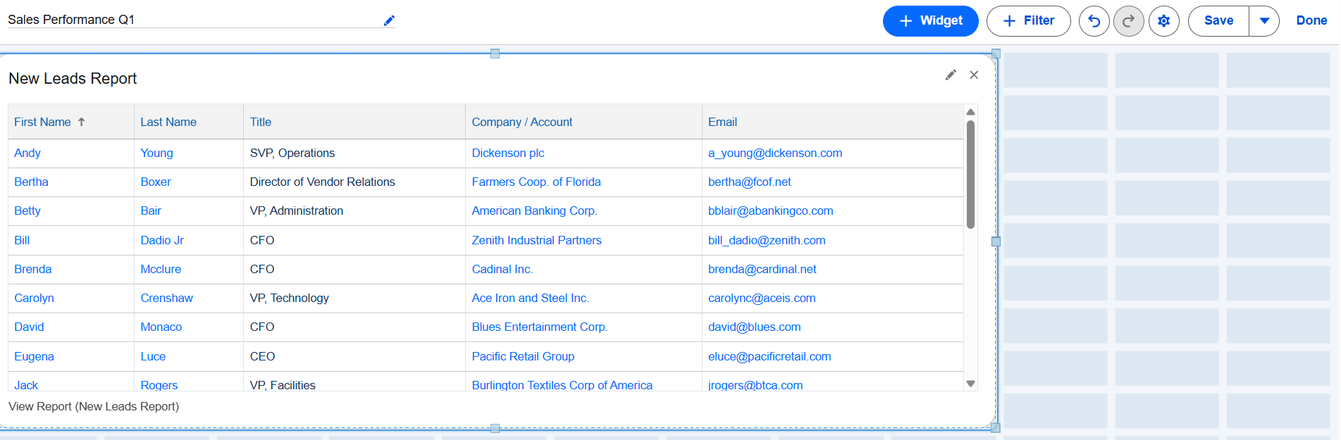
- Resize: Click and drag the corners of any chart to make it larger or smaller.
- Rearrange: Click and hold the top of a component to drag it to a new position on the grid.
- Titles & Subtitles: Click the Edit (pencil) icon on a component to add headers that explain what the data represents.
Step 4: Adding Dashboard Filters
Filters allow users to change the data shown across all charts at once (e.g., filtering the entire dashboard by “Region” or “Fiscal Quarter”).

- Click the + Filter button.
- Select the field you want to filter by (e.g., Created Date or Account Owner).
- Add Filter Values (e.g., “This Quarter,” “Last Quarter”).
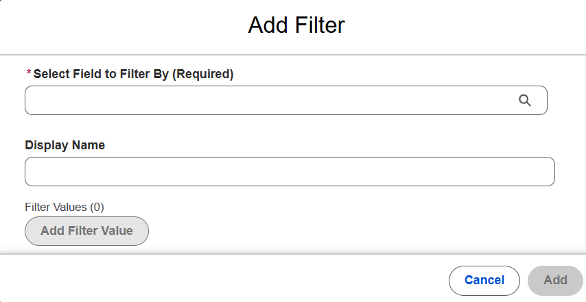
- Click Add.
Step 5: Technical Specifications for Your Guide
- Refresh Limits: Remind users that dashboards do not update in real-time. They must click the Refresh button to see the latest data.
- Running User: In the dashboard settings (gear icon), you must choose who the dashboard “runs as.”
- Run as Me: Everyone sees data based on your permissions.
- Run as Dashboard Viewer: Everyone sees only the data they have permission to see (this is called a Dynamic Dashboard).
- Subscription: Users can click Subscribe to receive an updated image of the dashboard via email on a daily or weekly schedule.

 Salesforce